When Should Your Ebook NOT Be Interactive
By now, it’s a well-established view that interactive ebooks are a great tool for use in schools and universities. They help students improve their learning capabilities, and access far more information than was previously possible with printed books. This is primarily because interactivity allows readers to access the information they need, when they want, and allows them to access other platforms as well.

But even interactive ebooks can have their downsides, particularly when it comes to issues such as usability. Users may also experience issues relating to how they can access and make use of the information outside of an interactive format.
Below are four key pointers that highlight just when interactive ebooks may not be the solution to the problem.
Accessing and saving content
As already mentioned, interactive ebooks are particularly useful for their educational benefits. They allow students and teachers to easily access the information they want, when they want.
But there’s a bit of a problem with interactive textbooks, and that deals with the ability to grab content and save it onto the device for later use. If the device being used by the user supports this function, it is much easier to grab and save plain images to the device in standard ebooks. This ideally should give students quicker access to images such as graphs.
Another factor to bear in mind is that ebooks are also generally published in HTML format. This format essentially makes sure that plain text is in a format that can be used by EPUB technology. With plain standard text, many devices allow text-selection functions supported by OS, like highlighting, copying, selecting all, and the like.
The benefit of this is that once a text is taken out of the EPUB context, the text generally doesn’t suffer any loss. If the font type is more complex than plain text, readers may lose this ability to effectively copy and paste into another document.
This could be, for instance, if a particular font that is not supported by the device you have, in which case, you’ll find a series of symbols replace “unrecognised” text features.
The ability to both grab and save images and text outside of the ebook is a great way for students to be able to access the information they want more quickly. It certainly reduces the amount of time they spend going to specific pages to view images, particularly graphs, or view notes alongside the highlighted text. It is a particularly useful concept for when it comes to writing essays and revising for exams.

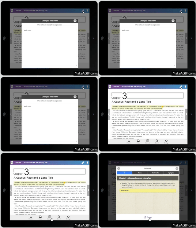
But the content found in interactive ebooks is a lot more difficult to extract from its base file and transfer to an outside programme than in standard ebooks. What this basically means for an interactive ebook users is that it makes it more difficult for students to transfer their highlights, notes, and specific paragraphs out of the ebook if they need to. This, in turn, affects how students can access and use the highlights and notes they have made in the original interactive ebook.
Students will no longer be able to layout the information in a meaningful way that helps them complete their tasks. If they can’t save text or pictures externally to the ebook, then it takes a time-consuming process to find what they need and when.
Usability
An important question for you to consider when creating your interactive textbook is that of usability. This essentially covers:
- The inclusion of widgets and other digital add-ons/plug-ins that add to the user experience;
- How easily users can access and use a technology;
- And, whether they are using and viewing through a website, a mobile telephone, or an ebook.
Interactive textbooks are more likely to include widgets, which should be included to highlight the narrative and add to the ebook’s interactivity. However, it will also, in turn, increase the ebook’s file size, with the larger sized ebook files taking longer to download.
Because of the various digital add-ons, such as widgets, that make up an interactive ebook, you’ll find that its eventual file size is a lot larger than a standard ebook.
Why are file size and usability important?
File size and usability are both important to consider because you have to take into account that several more layers make up your interactive ebook. You may also have included items such as videos, GIFs and moving images and widgets that all certainly contribute to increasing the file size. If they are not clearly marked as being accessible to users, you’ll find that it affects how users actually use your enhanced ebook – and it becomes a little less enhanced!
You’ll have to bear in mind that more information has to be downloaded and/or accessed with that ebook. However, two important points affect usability:
- The length of time it takes the ebook or website to download;
- The effectiveness of the user’s internet connection;
If it takes a long time for an ebook to download and/or the user doesn’t have a reliable internet connection, then you’ll almost certainly lose reader attention quickly and any future visits.
Usability for the visually impaired
Another important usability point to take into account is that of outreach to visually impaired readers, and how easily they can access the information embedded in the enhanced ebook. The technical aspects of interactive ebooks mean that this section of your readership may not have a fun time trying to read or use them. The interactivity of ebooks really depends on easy navigation and its high visual appeal.
With enhanced ebooks, a lot more of the interactivity and access to information depends on:
- Touching hotspots on the screen that will bring up what users need (we’ll get to that again a bit later);
- Easy navigation;
- And their high visual appeal.
However, unless you’ve ensured that the hotspots are particularly visible, visually impaired users could end up accessing an array of random and seemingly unconnected information. This basically ends up leaving them with three options:
- A reading experience that isn’t particularly meaningful;
- Or, they just have to wait for ebooks that are published in braille;
- They will not have access to the same information as other readers.
It may be much easier for visually impaired readers to have standard ebooks, where they can access audio narrations and enlarge the text more easily according to their needs. It also means they are not required to actually physically touch the screen in order to access information.
You can get around this potential pitfall by making the hotspots particularly distinguishable from the rest of the text through the use of a different font, larger font size and suitable use of colour.
Accessibility by ebook readers (ereaders)
Interactivity that’s unused or can’t be used is just plain annoying, and significantly reduces the sales potential of your interactive textbook. This can happen when you’re trying to embed audio and video clips but the ebook readers don’t support this.
Unusable interactivity gets particularly aggravating when students need to access a video or other piece of embedded information, but their ebook reader doesn’t allow them to. If this is the case, then your manuscript basically becomes redundant, and it doesn’t matter how much embedded information you’ve included. If it isn’t widely supported by ebook readers in your interactive textbook, your readers will just end up with an interactive ebook that isn’t particularly enhanced.
On the one hand, the ability to add audio and video clips are one of the features that make ebooks, particularly textbooks uniquely interactive. They ensure that readers can engage with the information at hand, access more information as and when they need, and surf the internet to gather more.

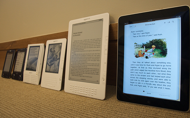
But, not all ebook readers have developed at the same rate, and with that not all support embedded media. At the moment, you’re more likely to be able to use embedded media such as audio and video clips via Apple, Kobo and Google platforms. With these, it is much easier for readers to access the embedded media file.
However, these media are supported only to a limited extent with Barnes and Noble’s Nook tablet and Amazon ebook readers. In the case of Amazon’s Kindles, embedded media is only really accessible in later generation Kindle ebook readers, such as later Fire devices. This limits how far you can sell your ebook. This is where you need to question how far you really need embedded media to enhance the reading experience.
Articles such as “The real reason enhanced ebooks haven’t taken off yet” give a good outline of some of the limitations of ebook reader technologies.
Redundant interactivity
Interactivity can be misused when you overdo the special effects you include in your ebook, as well as when the ebook is displayed on different screen dimensions. What might be clearly defined as an interactive element on a screen, such as that of a tablet, may not be so obvious on a smartphone screen.
Interactivity as part of the narrative
An important point here is how you are using the interactivity in the first place. Are you using interactivity as an actual part of the storyline, or will it just detract from the ebook? You need to take into account how the ebooks interactivity will help you get the information across as well as explain and narrate in an interesting way.
A moving animated image might be a fun addition, but it doesn’t really add to the storyline at all—and it could distract students. On the other hand, if you’re trying to illustrate how a flower grows out of a seed, or how the inner (covered) parts of a machine work, then interactivity becomes a good idea. If they don’t add anything to the narrative, they become redundant and are best avoided.

Compare this to one of the first interactive ebooks to be “published”, which was a version of Lewis Carroll’s “Alice in Wonderland”. This had moving images, but they had added nothing to the narrative – and were effectively redundant additions.
Interactivity overdose?
When creating an interactive textbook, for instance, you might also have to consider the question here of how much interactivity is too much? The Gruffalo author, Julia Donaldson, rejected having her renowned children’s book turned into an interactive ebook – for the simple reason that she felt it would detract from the words that children would read or hear.
Although Donaldson may well be talking about a children’s book, it’s a point that also bears weight with interactive textbooks and enhancing the information provided within them. Readers (particularly younger readers) may well feel overwhelmed if there is too much activity on the page, or if they are required to do too much to access the information.
As the saying goes, less is more, and having a few interactive hotspots available on any given page ensures users have a far easier time processing the information.
If you also have interactive ebooks and textbooks that can easily access the internet, for instance, youngsters may end up getting sidetracked and checking emails or surfing the internet for unrelated material.
It’s a fine line between creating an ebook that aims to help youngsters grasp the answer to a question or learn something new with visual aids, and overstimulating them with too much action. In the latter case, it could detract from the information at hand, and they’ll just end up more concerned with the special effects.
Creating hotspots
In interactive ebooks, hotspots are essentially those areas embedded on the page that “trigger” the ebook’s interactivity. This could be animated movements, accessing videos or audio clips or other elements that all contribute to making the ebook a little more user inclusive.
In standard ebooks, there aren’t really hotspots in the same way as there are in interactive ebooks (other than variations that can take you through to the contents page and then back again). This can be linked with an interactive ebook’s usability – make everything clear whether it’s through adding a header, or you’re pointing to the interactivity within the text itself.

Like other aspects of interactive ebooks, however, hotspots can become redundant when they are not visible to the reader. This is most likely to happen when part of the page is not visible on the screen.
It may well be that the points raised above may not be a problem at all, as schools may tend towards ebook readers and products that suit their specific needs. For instance, a school may opt for the kind of reader that allows them full functionality and interactivity without many problems. It may also be that a useful compromise can be found in file size, where authors standardize the file size of their enhanced ebooks and schools invest in ebook readers specifically for the types of enhanced ebooks their students use.
Either way, enhanced, highly interactive ebooks are likely to catch on in more and more schools for their ability to help students interact with and understand information.
Once you’ve achieved that fine balance in useful interactive content that engages readers and enhances the information they are accessing, your interactive textbook is well on the way to success.
Read more.
Ebook Formats Explained for Beginners
Book Widgets: Everything You Need to Know
The Ebook Author’s Guide To Images


