The Ebook Author’s Guide To Images
As the author of your book, you probably feel that the words you select are the key to expressing concepts and feelings and also define the quality and sales potential of your ebook. Seasoned publishers will tell you that the images you select can go further for you in sales, than the nitpicky selection of words and phrases. Although it may seem intuitive for cover images, it’s also true for the images and diagrams you select inside your ebook.
Here are a collection of tips to make your cover art and internal images sell your ebook.
Selecting images for an ebook means following a completely different set of rules and guidelines than for print books. You’ll find more limitations with the ebook cover, yet limitless possibilities within your ebook.
Cover Art
1. Select a cover image that has an immediate impact.
It’s an age-old cliché that we shouldn’t judge a book by its cover, but the reality is this is exactly what you and your readers do. The cover of your ebook will directly affect how many copies you sell. Our minds process visuals 60,000 times faster than text. Pick images or illustrations that tell your target reader “Buy Me.”



2. Learn your genre conventions.
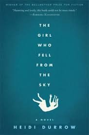
If you want to maximize the sales potential for your book, you must review whether it follows your genre conventions—failing to follow the genre conventions for your book may cause potential readers to dismiss your book as a book of another genre.
I recommend you look at the norms for the genre of your ebook. Spend some time trawling through the major ebook marketplaces and note the cover image conventions used by the bestsellers in your genre.

If a university professor writes an analysis of villains in the past year’s movies, then decides to have a gory cover to attract the eye of potential readers, he will attract the wrong readers. Thrill-seeking fans will be gravely disappointed when they open the book to find it full of research and statistics without any blood spilt.
There may be times when breaking with conventions will attract more readers. You will need to study the market well, before taking a risk. My recommendation is to research your readership and establish how they want you to communicate the message of your ebook with them –what matters is what your readers want.
3. Plan for Your Thumbnail.
Some images may be so intricate that reducing the size of the image exponentially reduces its value. What started as a mesmerizing elaborate image turns into a vague blur. Before you commit to an image, test the image at 60 x 90 pixels the size that appears in Kindle searches. For more examples, see 15 Ebook Covers: Success and Failure in the Kindle Store.


4. Harmonize all the elements: image, background, and typeface.
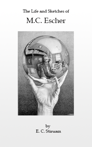
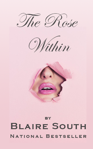
Your cover image is one of the main features of your ebook but it’s not the only one. It needs to work in harmony with both your background and the typeface you use. If you’re certain you’ve selected the right image, consider changing the color scheme or font.
The colors you select for your ebook images and illustrations influence the mood of your readers. There may be different shades that are used by your industry or niche. For example, business books tend to be blue. Worthy Marketing Group’s founder, says that this is because “blue is known to be a color that represents business, trustworthiness, and calm.” You can use a color scheme generator, like Coolors.co, to help you find the right scheme for your ebook.
 Vector artist Dooder – Freepik
5. Consider a text dominant cover.
We’ve been going on and on about images, but sometimes you don’t need an image on the cover of your book. Let’s take the example of the psychoanalysis of villains. The book would better target its readership with simpler images that are placed for context as a symbol of the topic and not as the central image, or without an image altogether.

Typography is an extremely important part of a well-made ebook. The cover of your ebook can live or die based on the text you use and this makes it essential you get the balance between illustrations and text right.
Images Inside Your Ebook
As with ebook covers, the world of images inside your ebook is significantly different than print books. Fortunately, unlike ebook covers the visual aid options within an ebook are virtually unlimited.
1. Color Options
With print books, color images and plates drive up printing cost, rendering the book a financial burden rather than a moneymaker. With digital books, color is free. So, add color images and watch your book come to life.
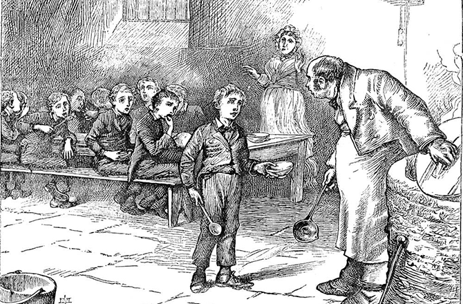

Both images of the beloved Oliver Twist asking for “some more” are the same dimensions and same file type. Yet surprisingly the black and white sketch is 638KB while the color image from the movie is a mere 310KB, less than half the file size. Which brings us to the next important topic.
2. Image Size
Simply avoid inserting billboard-size images in your ebook and you won’t have any problems. Generally, images that are within the same dimensions mentioned above for the cover photo should be alright. Most image file sizes may linger around 50KB. Larger images may go up to 500kb. If your images are 1MB or larger, then reduce the size and resolution, particularly if your readers will be using a tablet or a phone to read your ebook. As impressive as the extra detail of a 5MB photograph can be, it usually is not fully appreciated on small screens anyway.
Bear with me, or tiger with me, the two images look identical on your screen; however, can you guess the difference in file size?


Depending on your internet speed, loading time may have given it away. The first image is smaller. At only 108KB it takes up one-sixtieth of the space of the heavier 6.48MB image, with minimal loss in resolution. Which means you can have 60 images the size of the first in your ebook and still have the same file size. In fact, this image can go down one-hundredth the file size and still be just as stunning.
If the topic of your ebook relies on high-quality images and a 100KB image simply won’t do, then consider hosting the images online and embedding them in your ebook. The images then will not be in your ebook and as a result won’t affect your ebook’s file size; however, your readers will need internet access as they read to access the images. If this payoff makes sense for your topic, then there are many ways do it, one of them is ebook widgets which we’ll discuss a little further along in Real-Time Images.
3. Infographics
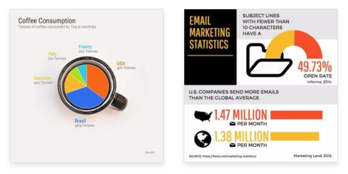
Old fashioned diagrams are less attractive for the reader and often times less effective as well. There is no reason for you to feel compelled to stick with them. Start using more dynamic layouts, colorful designs and creative means for expression. Although you can hire a graphic designer to make them for you, you can design your own for free online, at Piktochart, Canva or Venngage (source of samples below).
4. Image Gallery or Carousel
Is your focus on the text or the images? If your focus is on the text, yet you want to show your reader multiple examples without taking up too much space on the page, then add an image gallery. Image gallery carousels are a collection of images that readers can scroll through, seeing one image at a time. Your readers will be able to see all the examples you like, without disturbing the flow of the text. Inserting galleries in Kotobee is as easy as selecting a group of images on your computer.
5. Real-time images
Use an ebook widget. Ebook widgets are like miniature apps that you can insert in your ebook. For example, you can insert an Instagram widget with a search tag and the widget will automatically display the related images right in your ebook. Kotobee makes inserting widgets in your ebook quick and easy.
6. 3-D models
Remember your ebook is not limited to the 2 dimensions of an ebook. You can add 3d models of nearly anything, from marble sculptures to the skeletal system to concept cars. Your readers can turn the model left, right and all around. They can see the back of the object just as clearly as the front. Visit TurboSquid or Free3d for free 3d models that you can download at no cost and include in an interactive ebook with Kotobee.
7. Motion-driven illustrations
One of the great benefits of an ebook is that you can include motion graphics and videos in your book. When showing readers a process, individual images can be helpful; however, animations can be far more captivating and effective. If you want a product that stands out from your peers then you should give real consideration to including motion-driven illustrations. Try Google’s Web Designer.
8. Videos
The moving picture. When you write print books you can’t dream of including an animated gif or complete video. If you’re writing an ebook, don’t need to limit yourself to still images. Include your own videos, embed YouTube videos, or insert a live streaming video.
Ideal file sizes
Size matters when it comes to the images you use for your ebook. Using a 5MB image is unnecessary and can cause major lags on some devices and could jeopardize your sales. But that’s not the only reason size matters.
Some sellers (including Amazon) charge based on the size of the file that you upload. This means that if you select the wrong size you won’t just pay for it by losing sales, you will literally have to pay more money to advertise your ebook – making size doubly important for business.
Amazon
To ensure the best quality for your image, particularly on high definition devices, the height of the image should be at least 2,500 pixels. Ideal dimensions for cover files are 2,560 x 1,600 pixels. Note: The minimum image size allowed is 1,000 x 625 pixels. The maximum image size allowed is 10,000 x 10,000 pixels.
Apple iBooks
A recommended size is approximately 1,600 pixels wide by 2,400 pixels tall. For best results, your image should be 900 DPI and no larger than 1 MB. Covers should be at least 1400 pixels wide.
Barnes & Noble
The recommended size is approximately 1,600 pixels wide by 2,400 pixels tall. The width should be a minimum of 1,400 pixels.
Kobo Books
The recommended size is approximately 1,600 pixels wide by 2,400 pixels tall. The minimum width is 1,400 pixels. Note: readers are 3:4 ratio.
Image Dimensions
Is the image the right dimensions? While there are a number of different sizes that a printed book can come in, with an ebook the options are far more limited. Here are the screen ratios (width: height).
- Kindle 1 : 1.6
- For tablets and iPads 3 : 4
- Smart phones 9 : 16
- Desktops 1:1
The size variations are a key element in the design of the cover. Make certain that your images fit within the overall dimensions of the screen of your readers.
Getting it Done
Hiring a freelancer
Does the designer share your vision? There are some excellent tools and brilliant pieces of software available to help you make your ebook. However, you shouldn’t disregard freelance designers and illustrators, if you decide you want to use one, there are a few things you must take into account:
- Look in the right places. You can waste a huge amount of time by looking for freelancers in the wrong places. Some of the best sites you can find freelance designers and illustrators are:
- Review their portfolio carefully. You need to know that your freelance designer will be able to deliver on the brief that you set them. It doesn’t matter how good their credentials are, if their style isn’t a good fit for the vision you have for your ebook, then any money you spend on them will be wasted
- Set your budget. Be very clear on how important the design and illustration is to your ebook. While hiring a skilled freelancer will allow you to enhance the quality of your ebook, there is no sense in spending money, just for the sake of it.
My recommendation is that you give real consideration to how much of your ebook you can complete yourself and whether you need to use a freelancer.
Sourcing your own visual content: Do you know the copyright conditions?
If you do decide you don’t need to use the services of a freelance designer or illustrator, it’s important that you are able to find images that will allow you to create a high-quality book. There are a few things for you to keep in mind when sourcing images for your ebook:
Attribution and copyright
Using images that you don’t have the right to use, or which you have not given the right attribution for, will land you in a lot of trouble. Make sure you understand the best practices for attribution and copyright.
Where to find images
There is a range of different places that you can look for images to use in your ebook. Some great examples are Burst, Unsplash, and Pexels.
I recommend again, that you familiarize yourself with attribution and copyright – there’s no sense in wasting your time looking for and finding great images if you don’t know how to use them. For more, here are 45+ Free Resources for Writers and Self-Publishers.
Conclusion
Images and illustrations are an important part of an ebook. Even if you decide you are going to prioritize text, you still need to know the reasons for and against choosing images and/or illustrations. Make the most of the visual side of your ebook to make it an even more valuable resource for your readers.
Read these posts.
9 Ebook Cover Tips for Beginners
How to Optimize Audio for Your Ebook
Turn Your Blog Posts into an Ebook in Minutes





Bonita Hellmann
May 17, 2023I appreciated your blog. I recently had to unpublish my illustrated children’s book with Kindle because it was not formatted correctly ( after they congratulated me that the book went live). Who can I work with to format my bk correctly for kindle?
Kotobee
May 30, 2023We’re sorry to hear about the formatting issue with your illustrated children’s book on Kindle. To format your book correctly for Kindle, you have a few options:
1. Self-formatting: Follow Amazon’s Kindle Publishing Guidelines to learn how to format your book for Kindle.
2. Professional formatter: Consider working with experienced formatters who specialize in Kindle formatting. You can find them online or through recommendations from other authors.
3. Formatting services: Some ebook publishing platforms, like Amazon KDP, offer formatting tools or recommended services to help with ebook formatting.
Proper formatting ensures a smooth reading experience. Research and choose the option that suits you best. Good luck with formatting your children’s book for Kindle!
Marti
October 4, 2023What was wrong with it?