4 Simple Animation Techniques for Ebooks
Most ebooks focus on text and neglect visuals such as images, which is a shame. After all, having exciting visuals in your ebook can make the reading experience more engaging and help readers understand your content better. If you can achieve all of that with regular static images, imagine what you can do with animated ones!
Animations can appear hard to create at first, but the process can be simple when you use the right tools. Moreover, you don’t have to make your animation fancy or complicated for it to achieve its intended effects. Even a simple animation that lasts a few seconds can make a huge difference.
That’s why in this article, we’ll show you the best animation techniques for ebooks. They’re all easy to use, so you can get started with them right away.

What Are the Types of Animations You Can Use in an Ebook?
Ebook animations can be used for various purposes, such as illustrating ideas or simply breaking up long bodies of text. However, it’s important to use an animation file type that is compatible with your ebook format. As most ebooks use HTML, we will focus on HTML-based animations.
An EPUB’s underlying technology is HTML, so you’ll find that the following HTML-based file types tend to be the most common in ebooks:
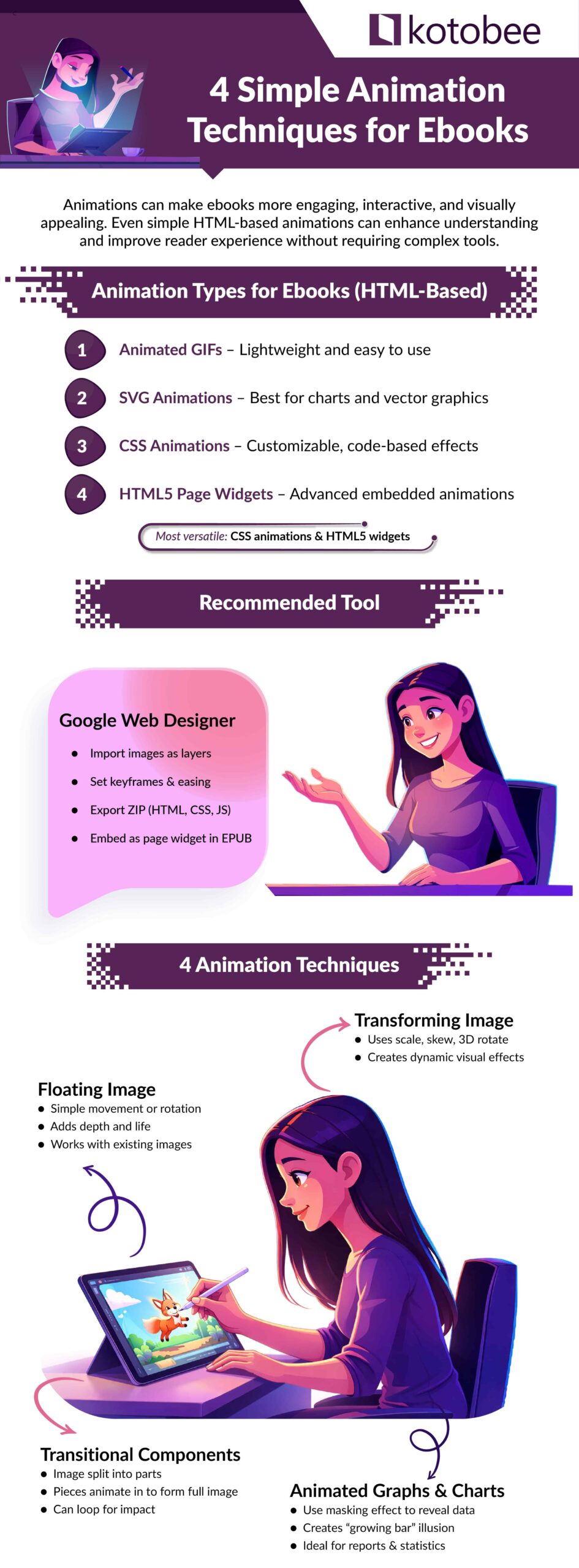
- Animated GIF image: GIFs are common on the internet due to their ease of creation and lightweight nature, making them ideal for ebooks. They won’t take up much storage space, but advanced animation editing might require specialized software.
- SVG animations: SVG animations are perfect for creating smooth and professional effects for charts, graphs, and other two-dimensional vector objects. Since SVG files are inherently vector-based, they don’t support bitmap images like photos.
- CSS animations: Highly customizable, CSS animations are commonly used on web pages and can also enhance ebooks, provided your ebook creation tool supports adding custom CSS code.
- Page widgets (HTML5 animations): Using a page widget, you can embed HTML5 animations into EPUB files for seamless integration. In reflowable ebook layouts, the widget’s position dynamically adjusts with the text, enhancing compatibility.
In this article, we will focus on CSS animations and page widgets, as they are versatile and can significantly enhance an ebook’s interactivity. CSS animations are ideal for simple, code-driven effects, while page widgets enable the embedding of more advanced animations created with HTML5 or other tools. These two methods offer a range of options for animating ebooks, depending on your technical skills and the capabilities of your ebook creation software.
Best Software to Use for Creating HTML5 Animations
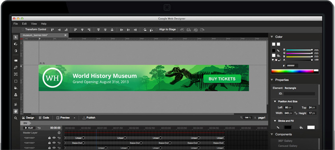
Google Web Designer is a free and user-friendly tool for creating HTML5 animations. While it’s primarily designed for animated banners and ads, it’s also a great option for creating animations to embed in your ebook as page widgets. If you’re looking for quick and straightforward animations, this software is a strong choice.

The basic workflow in Google Web Designer is as follows:
- Import each of your images, where each of them turns into separate layers.
- For each layer, specify your key-frames and choose your easing functions.
- Export your animation as a ZIP package containing the HTML, JavaScript, and CSS files.
The exported ZIP file is a ready-to-use page widget that can be added to your ebook chapter.
Check this list for more animation software: 6 Best Animation Software for 2022 (Free and Paid)
4 Simple Animation Techniques for Ebooks
Once you decide which format you want to use, the next step is choosing the right animation technique for your ebook’s intended audience. No matter the file type you use, you’ll use one of these four techniques below.
1. Floating image
This is the simplest form of animation, an image that moves or rotates in different directions (may rotate as well). Depending on how natural the movements are, you’d be surprised by how much life it can bring to your ebook and impress your readers. You’ll find floating animations all across the web. Here is an example from an interactive ebook we created about birds.
Here is another two examples with only some basic rotation. Applying correct timing can give a very believable effect.
You’ll find these types of animations used all over the web. They’re a simple but effective way to add visual interest and engagement to any content. To make the animation a little more complex, you could add a second, stationary image behind the moving one. This will give the animation more depth and visual appeal. Such as with these two examples:
The best thing about this type of animation is that it can be applied to any of your current images, with no extra resources. We recommend that the image background matches that of your pages to make the animation look more natural.
Transforming image
This type is quite similar to the floating image, but you are transforming it instead of moving it. The supported transformations in CSS3 are scale, skew, and 3D rotate. Just make sure to choose your images carefully as a wrong transformation can make the animation look unnatural. Here is a combination of skew and 3D rotate transformations applied to a bird in our interactive ebook.
Transitional components
Let’s take a step further. With a transitional animation, your image is divided into sub-images. From a blank screen, each sub-image makes its own entrance from different directions, ultimately ending up completing the original image. You can loop this animation by making the sub-images transition back out of the screen.
Your choice of sub-images and their transitions control how appealing the animation will be to readers.
Graphs and charts
If you’re creating ebooks with reports or statistics, this type of animation might come in handy. With minimal effort and simple know-how, you can animate your charts with a touch of magic, and make your readers think it was a ton of work.
To get started, you will import the graph or chart as an image into Google Web Designer. On a layer above, you will create a white box. This will be used to give a masking effect. Initially, the white box will come on top of the graph/chart, except for the horizontal & vertical axes. You will be transitioning the white box vertically upwards to reveal what’s hidden underneath. The reader’s eyes will trick them into believing that the bars are what’s growing upwards from below when, in reality, they’re just being revealed.
If you’d like to loop the animation, you can transition the white box back down to hide the graph once again. With the correct timing, this will greatly impress your readers.
Here is a more complex example where additional images were animated along with the white box as the cap for the bars.
Conclusion
Contrary to popular belief, creating animations can be quite easy with the right tools. And now that you know how to do it, you can create your own and add them to your ebook. With that, you’ve taken a step towards crafting an exciting interactive ebook!
Which tools do you use to create animations for ebooks? Have we covered all there is to know about this process? Let us know your thoughts in the comments below.
In the meantime, start animating!

You might also enjoy:
5 Hacks for Creating a More Engaging Ebook
Cool Trick: Creating Dynamic Character Names in Ebooks
How to create an interactive ebook: A step-by-step guide
How to Optimize Videos and Add Them to Your Ebook
The Ebook Author’s Guide To Images


Rod
August 15, 2016A good start at a reasonable price is Hippani Animator (for Windows and Mac).https://www.hippani.com/
Easy to create widgets which add to the Kotobee experience.
Kotobee
November 13, 2017Thanks for sharing, Rod.
Kotobee
March 15, 2017You can find it at our website https://www.kotobee.com
John Booker
June 13, 2017Waw this the first time when i have reached to some absolutely great animation techniques for ebooks.
Kotobee
June 14, 2017Great! Then I’m sure you’ll love this article:
https://www.kotobee.com/blog/5-hacks-for-engaging-ebooks/
Harry
July 24, 2017I’m looking to hire an animated illustration for my ebook. Can you clarify if I’ll need a widget or if a GIF Image will suffice?
Kotobee
August 10, 2017Since an EPUB’s underlying technology is HTML, here are your options:
– Animated GIF image
– SVG animations
– Flash movie
– CSS animation
– Page widget
Animated GIF images require special software to create (e.g. Photoshop) and the animation file sizes usually are very large. SVG animations support only vector graphics and require a development background to create. Flash is outdated and won’t be supported on readers like Apple iBooks, let alone mobile. This leaves us down to CSS animations and page widgets. They are both basically brother and sister. Instead of applying CSS animations directly in the page, page widgets apply CSS through an iframe (window). We prefer to use page widgets since it is better organised to have your entire animation in a single file.
Let me know if that answers your question.
Harry
August 14, 2017Got it. I’m trying to make sure that I can accurately match the various animations from the article with the techniques you’ve outlined, like the floating birds and the guy blinking and waving. Would those be CSS? If not, please clarify. Thanks.