8 Common Mistakes Found in Interactive Ebooks
With their colorful, moving graphics and ability to engage readers with information, interactive ebooks are confirming their place as the next generation of reading materials. It isn’t just about giving readers much more opportunity to engage with the information at their fingertips. It’s about making use of the technologies in our everyday lives to alter the way we learn and communicate with the world around us.
But the technologies involved in creating the most effective interactive ebook can sometimes get overwhelming. You’ll need to make sure you’ve got an effective grasp of all the technologies needed, whether it’s restructuring the layout and format to creating stand-out graphics and animations.
There are many mistakes that you see over and over again in interactive ebooks. The following 8 tips have been set out to help you avoid making the sort of technical mistakes in your interactive ebook that can ruin the reader’s experience.
Online vs. offline videos
One of the bonuses of interactive ebooks is the ability to include videos in them, giving users the benefit of an alternative source of information. Not everyone’s a great fan of reading great tracts of text, and this is the perfect way to reach out to more potential readers.
At the same time, ebook creators can make the mistake of simply hosting a link for an online video. That means the reader has to have a consistent internet connection to buffer the video. This is solely because the link takes the user out of the ebook and onto the web. You can, instead, upload the video directly into the ebook, which means that the reader can still view it, but without necessarily having an internet connection.
Imagine having to wait for each video to buffer! Frustrating, isn’t it?

Hope you’re not waiting for something to happen.. this “video” is just an example!
Not every user may have consistent access to an internet connection, making a link that takes them out to an external video tricky. Think of the RSS feeds that pop up in a lot of websites, such as newspapers and magazines – this is basically a link to a video elsewhere on the web.
It only really works if you can be certain your readers have consistent web access, but it still means an out-of-ebook experience. To get around this and make viewing easier for the reader, you can upload the video file to the ebook. Many ebook authoring software programs allow the author to choose either option easily.
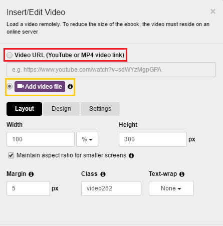
Yellow: Uploading a video file (no internet connection needed, but bigger file size).
If you’re going to upload the videos directly into the ebook, you have to be careful of how this affects the final file size of your ebook. Depending on the number of videos, their duration and quality, you’ll find that uploaded videos will have a drastic effect on the size of your final publication.
Choosing the wrong platform or export format
Choosing the wrong platform is also another potential pitfall for you to consider. You need to both target your audience and consider how easily your ebook can be accessed by them.
For instance, with its range of Kindle ebook readers, Amazon has long had the most success at making ebooks accessible to a wider global audience. But the Kindle’s outreach is by no means worldwide, with issues including:
- Sketchy services at best outside North America and Europe;
- Limited to no support for many languages and alphabets;
- Restrictions on bank account locations (meaning you can only buy Kindle-friendly ebooks if you have a bank account in certain countries).
This is where you may fall into the trap of making your ebook basically inaccessible, even if Amazon’s Kindle or Barnes and Noble’s Nook reader seem a great idea at the beginning.
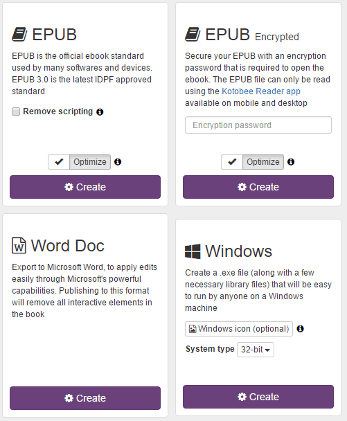
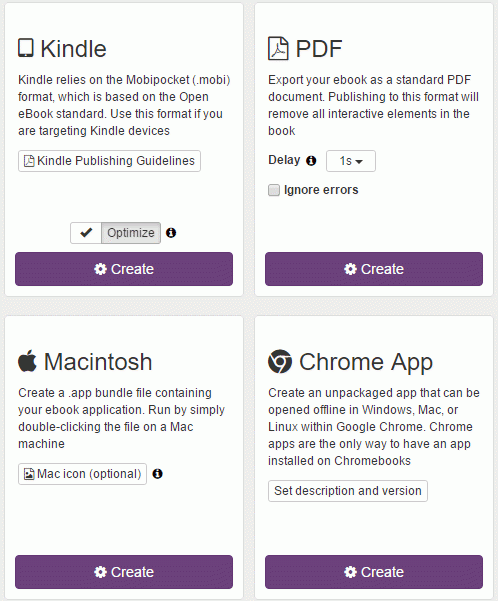
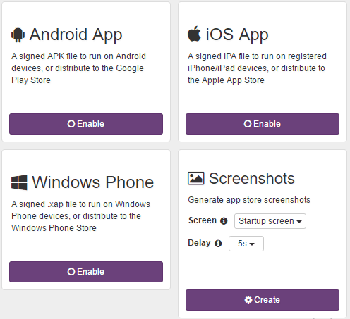
Here are the most common export formats, as featured in Kotobee Author‘s “Export” tab:
Platforms such as the Adobe Ebook Platform or Google’s and Apple’s respective App Stores can become an excellent alternative, with far greater potential outreach.
Smartphones are widely acknowledged to be playing an increasingly active part in the way we interact with the world around us. With these being a not too far fetched alternative, readers – particularly school students – will find the ebooks they want more easily accessible.
Too many widgets
The immense opportunities for making your interactive ebook truly interactive using book widgets are both your best friend and your own worst enemy. On the one hand, including widgets can help the reader make notes, take quizzes and gain immediate feedback, and access the information in pretty much any way they want to.
It means your readers can do a lot more with their ebooks than was ever possible with their printed versions. However, adding too many widgets can clutter up your publication to the extent that it simply becomes confusing and reduces the ebooks functionality.

You also have to consider that the more widgets you add, the bigger the ebook’s eventual file size! That’s going to take more time to download, and will eat up more data.
It can be hard not to get carried away with the idea that having an array of widgets can improve the reader’s experience and engagement with the information. This is especially so when they’ve been embedded within the ebook’s format, as readers won’t have to leave to an outside website or link – instead, the information is directly available right there in the ebook.
The key here is to ensure that you include enough widgets that actually boost reader engagement and enhance their experience.
Read more: Everything You Need to Know About Book Widgets
Making animations work
Connected with the above point on widgets is the fact that you need to make sure the animations you include are in the right format too! The easy part is that the underlying EPUB coding is HTML – but it’s also easy to get mixed up as to what software you need.
There are several options available out there, including animated GIF images, SVG animations, CSS animations, and page widgets. If you’re looking to create a very simple moving image, you could just use a GIF.
The downside to this is that these files are large and unwieldy, even at the best of times, and you’ll also need specialized software such as Photoshop. Many readers will also not have the patience to deal with software such as Flash, which often isn’t supported by readers such as Apple Books or mobiles, anyway. You can probably get away with using free tools like giphy.com and gifmaker.com in a lot of cases.
The best option for getting animations just right is by using CSS software and page widgets, which can work very effectively together. Although CSS animations can be directly embedded into the page, your best bet is to use page widgets instead. This latter option allows you to embed the animation, as a single file, on to the page via a window.
Getting the font-size right
CSS software can take some time to get comfortable with, especially when you’re not well versed in how to navigate it. Getting font-size just right can take a bit of time – and it’s best to bear in mind readability. Having too many font sizes on the page is just annoying for the reader, and can make future alterations of the “em” tricky.
In a nutshell, “em” is essentially the font width equal to the height of the type size being used at a given point – so if you’re using a font-size of 30px, that’s equal to 1em. So, 2em would be 60px. It also affects the size of the border surrounding the text and pictures.
If you forget to define the “em” in the ebook layout, you’re basically forgetting the base unit for the various other elements that make up the page. If you do define it correctly at the beginning, you can make adjustments to page layout within the borders you have set out fairly easily.
Remember that any changes you make to font size trickle down to the daughter elements that are attached to the main “em” you have defined.
Poor usability
Poor usability is a big, BIG mistake that keeps cropping up – and it can mean the difference between readers quickly giving up on your book or carrying on. It can also easily be remedied through simple testing before you release the ebook.
Users have a thirst for technology, just as much as they have a need for easy-to-use, simple interfaces and the ability to access the information they want when they want. Usability essentially deals with how easily users can actually use your ebook and covers everything from being able to read the text easily to being able to access the information.
This last part covers things such as how findable information is, how many taps a reader needs to make before the information they want comes up, or how efficient the technology is. It also deals with how accessible the information is (for instance, a hidden menu isn’t particularly useful, and can affect how useful readers find your ebook).
In an interactive ebook, usability is your new best friend. It doesn’t matter whether it’s creating an image that clearly moves (and highlighting that it moves), or highlighting that you can tap on a picture to bring up a pop-up window with more information.
Using the wrong layout format for your ebook
This can really mess things up if you’re not careful. Connected with usability, having the right layout format means your readers will have a much easier time of interacting with your book.
Put simply, you have the choice of using a reflowable layout, which shifts around the page layout depending on the size of the device you are using or whether you are reading it horizontally or vertically. Or you can choose a fixed layout design, which “locks” every item on the page in place.
With design-heavy ebooks, you need to go for a fixed format layout, which ensures that all pictures and text items remain in place. It matters simply because, if you chose the reflowable format and change the device or you shift from vertical to horizontal reading, you’ll find that the pictures and text change to fit the page.
This means that the text and pictures that should go together might end up on different parts of the page. You can find more details on how the layout format can affect the design of your interactive ebook through the link below.
Watch this video for a better understanding of reflowable and fixed layout modes
Read more: Best Ebook Layout Format: Reflowable or Fixed?
Using Poor images
Choosing poor images are a great way to create an eyesore rather than something that attracts potential readers. This is even more important in an interactive ebook, where elements of the text are more focused on using pictures.
It is particularly so if you’re getting readers to tap on parts of the image to pop up more information. You need to keep an eye on the basic quality and size, the pixel count (or, the resolution), as well as ensuring you have full rights to use the book.
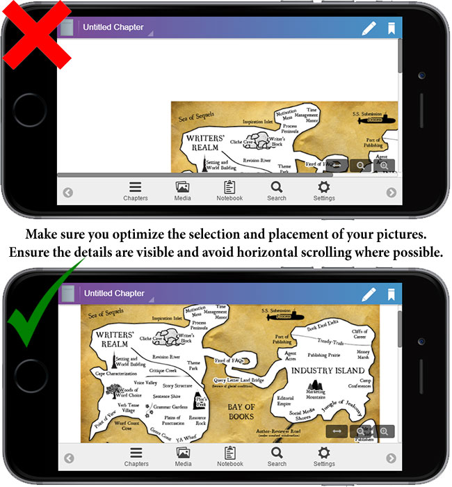
Every detail has to be as crystal clear as possible so that readers have a page that is as well designed as it is well written to look at. Without those considerations in place, you will lose an awful lot of readers who won’t come back if you decide to publish more ebooks.
Bottom line
Interactive ebooks have become a bit like the phrase “Orange is the new black”. Once considered a bit faddish and unlikely to catch on, the increasing switch to ebooks has underlined the need to get comfortable with how to use technology. Once you’ve got the hang of the above points, you’ll find it much easier to create the most effective interactive ebooks.
You might also like:
5 Hacks for Creating a More Engaging Ebook
How to Create an Interactive Ebook: A Step-By-Step Guide
How to Edit EPUB Books Manually
More from Our Blog