Best Ebook Layout Format: Reflowable or Fixed?
Ebooks have blown the market open for authors to get their creations out to the widest possible audience. They have also opened up a big can of worms when it comes to deciding the technologies behind best ebook practices.
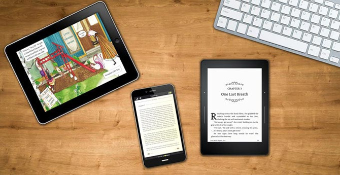
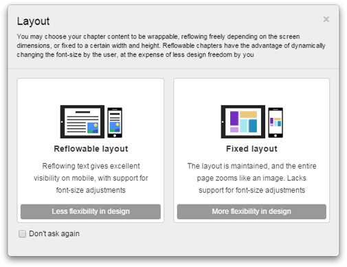
When creating an ebook, there are two layout formats you can choose from: reflowable layout or fixed layout. But which one is best to choose when you want to create content that people can easily download and read?
Each layout format has its own uses, advantages and drawbacks. It all depends on what you’re creating and who you’re creating it for.
One of the best ways to decide what format you’d need for your book is to look at the pros and cons of each:
Reflowable layout
This layout format provides responsive text and images. Their look and positioning on the page depends on:
- The screen dimensions (mobile, tablet, or desktop)
- The screen orientation (portrait or landscape)
- What changes you’ve made to text size
Reflowable layout is the go-to ebook format for publications. Basically, this layout treats the content as floating text and images, then arranges them according to the screen size. Also, when users switch between portrait and landscape views, the content would rearrange itself to optimize readability for the new dimensions. Another importance is that the reader can change the size of the text which makes readability easier on smaller screens and for most readers with minor visual impairments.
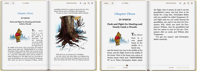
As the content renders itself to whatever screen dimensions, there is, in effect, “less thought” needed by the reader in terms of scrolling as they only ever need to scroll vertically, making the activity as natural and thoughtless as turning a page on a printed book. This just makes for a more friendly ebook.
The number of pages in a reflowable layout ebook is dynamic – it depends on how many it would take to fit the same content on the current screen size. Large screens would result in less number of pages than smaller screens.
It is standard practice that most text-heavy, single column format ebooks are in reflowable layout, which ends up on ebook readers either in Mobi (Amazon Kindle) or EPUB form. Most authors also choose this format as it’s widely distributed (making it the more profitable option). This entails that there will also be standard embedded fonts, tables, bullet lists, and formatted texts.
You’re more likely to find most fiction and non-fiction (biographies, memoirs, history publications and business guides) genres in reflowable layout.
The pros
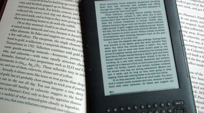
Most ebooks use a reflowable layout because of its convenience for readers. This layout makes it easier to view the same ebook from different devices without compromising visual clarity.
Below are the key characteristics of the reflowable layout in ebooks:
- Text can be enlarged on screen without losing any essential formatting, making it very readable on small screens.
- Reflowable layout ebooks are easier, quicker, and cheaper to produce.
- They are saved in a smaller file size (so retailers are less likely to slap on extra download charges).
- Reflowable ebooks can be uploaded to most distributors.
- They will work well on most ebook readers and devices (whether laptops or smaller devices).
The cons
While the reflowable layout is convenient and widely used, it does have some limitations that may not suit every author’s needs. If your content requires precise formatting or complex design elements, the fixed layout might be a better option. We’ll discuss this in more detail in the next section.
For now, let’s take a look at the reflowable layout’s disadvantages:
- Authors (and designers) have little to no control over how the text and pictures are displayed on screen – they are simply attached to how the text is viewed and read.
- Reflowable ebook formats only support simple formats such as text-heavy single columns
- There is little support for supporting embedded fonts.
Fixed layout
The fixed layout format (also sometimes referred to as pre-paginated layout) acts like a digital lock on text and image placement, in the same way that a PDF works. This is a big bonus for when the design and look is so important to the end ebook – think of a comic book or children’s illustrated book, and picture-heavy books where certain images go with particular parts of the text. Fixed-layout is the go-to ebook format for image heavy publications, such as heavily illustrated books, cookbooks and recipe books, coffee table books and the like – the fixed layout in this instance is essentially the digital version of typesetting.
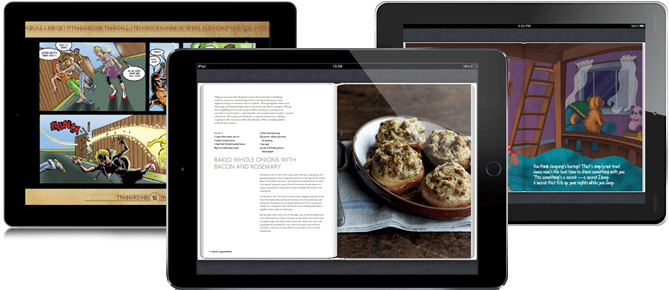
This format essentially works as a digitized replica of printed books, with the added benefit of being able to add interactive elements. As a result, you may have to zoom in and scroll both vertically and horizontally if you want to read the full text. It’s not the most user-friendly format, but it does let authors and designers have complete control over design – important if the text and images are interlinked.
This is especially important if you have interactive elements overlaying each other. For example, imagine you’re creating a children’s ebook to teach the sounds of barn animals. You could add an image of a barn then add independent images of the animals to appear inside the barn. That way, you can add interactive elements like audio-on-click and animations to the animals’ images within the frame of the barn. To do this, you have to make sure that the design stays how you designed it, and not as the screen dimensions recommend.
This is a particularly good format for interactive multi-touch books, cookbooks, manga and graphic novels, travel guides and the like.
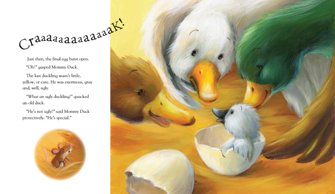
As another example, Amazon sells two versions of children’s story book “The Ugly Duckling”: a reflowable layout version, and a fixed layout version. Here’s a screenshot from the fixed layout version:
Until the recent past, the fixed layout was generally seen as not very user friendly, although fortunately for authors (and publishers), this is changing. The technology, particularly in Adobe InDesign, is quickly catching up with the giant leaps forward in digital reading.
This means you can define how the text wraps on the page, where lines start and end, and where the text is placed (whether it’s above an image or to the side). It’s useful if you’re trying to highlight a particular image, for instance, which is particularly important in the narrative. You also have full control over where and how much text is placed on the page, and where the images are. This control remains, no matter how the reader scrolls or if they’re reading the ebook in portrait into landscape.
Other authoring tools, such as our free Kotobee Author, allow you to import from existing fixed-layout formats such as PDF, and distribute the pages into a fixed-layout EPUB ebook.
The pros
If the design of your ebook is one of the most important parts of it, then you should try using a fixed layout. That way, you can insert images and text however you like on the page with minimal restrictions.
Here are the pros of using fixed ebook layouts in more detail:
- The author and designer keep control over how the ebook is displayed on screen – with images and text locked to specific points to maintain this control.
- Fixed-layout format is also the best option if your text is multi-column, where fixing text at specific points on the page is important.
- It is beneficial if the key element to the book is the design – as in cookbooks and graphic novels in particular.
The cons
On the other hand, a fixed layout can limit the reader’s experience, as it restricts flexibility in adjusting text size or layout. This could lead to frustration for some readers, especially on smaller screens. Additionally, publishing an ebook with a fixed layout may come with higher production costs compared to a reflowable format.
We’ve listed the flaws of the fixed layout for ebooks:
- Fixed layout ebooks don’t give the reader/user any choice in font, spacing, margins, or text size (which is not ideal if you’re also targeting the book to visually impaired users, especially if the text is too small).
- Not every ebook reader or retailer supports this layout, and some retailers will not distribute this format too, so your outreach will be more limited.
- Fixed-layout ebooks tend to be larger in file size, so some retailers, such as Amazon, will enforce higher download fees.
- Fixed-layout ebooks are also more expensive to produce and update, making it a bit annoying in terms of profitability.
When exporting in this format, you’ll end up with an ebook in formats such as KF8 (which is now becoming less popular) and Kindle textbook creator (for Amazon Kindle Devices); EPUB3 (Apple, Google and Kobo); PagePerfect and NOOK Kids (Barnes and Noble).
This is a great format if you’re using full-bleed graphics, background images, double-page spreads, multi-column text and vertical text. It’s also the better layout for supporting embedded font, depending on the device and software available on the user’s end.
The one thing to remember, however, is that a fixed layout looks better (and works better) on a bigger screen. Put another way, it’s easier to read a fixed layout text on a computer, laptop or tablet screen, but fairly annoying on a mobile. Think of Alan Moore’s famous graphic novel “V for Vendetta” – here, the design element and use of images is obviously an important part of the story-telling.
For a better understand the technical differences between the two layouts, read this support article: Understanding reflowable / fixed layout formats.
Now that you know the advantages and disadvantages of the fixed and reflowable layouts, there’s two main considerations that must me kept in mind. Is your content linked to each other in a way that any images, texts, audio, etc. depend on each other for where they stand? Also, who is your ebook designed for?
Interactive vs Static
If text and pictures aren’t specifically linked with each other (essentially, the pictures simply help emphasize the text’s ideas rather than form a key part of the storytelling), you’ll find the reflowable layout format works best. For example, if you take converting a “Winnie-the-Pooh” book, you can emphasise the central character’s famous love of honey with image of a bee on the page. This design device avoids having a text only page, but the bee isn’t linked to a specific sentence or paragraph in the page.
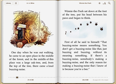
If, on the other hand, pictures and text are linked together, as in interactive multi-touch books, the fixed-layout format takes top spot. It’s also the best option if you’re looking to create image spreads (think of coffee table books where images are frequently placed as a double page spread).
This is because the content (and that includes images too!) is laid out to fit the screen, rather than to read like you’re holding a printed book in your hand. Images will therefore look smaller in the reflowable layout – because the image will be reduced to fit horizontally onto one page (rather than two).
Reader accessibility
How accessible is your ebook to visually impaired readers?
No matter how awesome your ebook is, if it doesn’t allow them to alter the font size, it will make it a hard task for them to read content (and off-putting).
On one hand, a fixed layout format may be good, because it allows readers to zoom in and out at will – but it may be very inconvenient to constantly scroll to read the text.
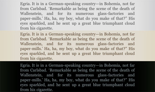
On the other hand, this is where a reflowable layout may work best, as the reader/user will be able to adjust the font which then adjusts the book’s layout to fit the screen (text and picture placing gets moved accordingly). Many readers also provide further accessibility features than only the text size, such as font type or color overlay to assist those with Irlen’s Syndrome.
Combining both layouts
There is a grey area where you’ll find it appropriate to combine both reflowable and fixed layouts in the same ebook, across different chapters. For example, if you’re writing a hypertext fiction or CYOA (Choose Your Own Adventure) ebook, you can create a chapter of text followed by a page of an interactive map, or even a game. Then the readers’ choice would determine how the story progresses from there. This would be the best way to create an ebook that has both aspects of long-form, one-column text complemented with graphics and highly interactive elements on interchanging pages.
Be warned though, that many readers do not support both layouts in the same ebook. On the top of the list comes Apple iBooks (unfortunately). Overriding a book’s global layout format by the chapter is a valid EPUB specification (check the rendition:layout property). Nonetheless, Apple Books forces the book’s layout onto all the inner chapters.
The good news is that Kotobee Author and Kotobee Reader allow the authoring and reading of mixed-layout ebooks, where you can actually specify whether each chapter you create is fixed or reflowable.
Conclusion
Just use this article to answer these four questions, and you should immediately know which format to choose and why:
- Is it an interactive, picture-heavy book or a text heavy novel?
- Is there one column per page or a more complex layout?
- Are the graphics and images a key element of the text?
- Who is your target audience?
Now it will be much easier for you to decide what layout format you’ll need for what type of ebook you’re looking to create. With picture heavy books that rely more on design and the need to keep text and images “locked” in place, you’ll find that fixed layout formats give you the best look to the ebook. For ebooks with a much simpler layout and less need to keep text and images linked together, a reflowable layout would work better.
You might also enjoy
5 Hacks for Creating a More Engaging Ebook
The Art of Writing Short Stories
How to Capture a Young Reader’s Mind: 5 Essential Tips
Children’s and YA Authors: Don’t miss these 13 Resources
How to Create an Interactive Ebook: A step-by-step Guide





Tyler Pots
February 7, 2023Amazing Write-up. Keep Doing the good work.
Kotobee
April 3, 2023Thanks Tyler! glad you found this helpful.
Abdoulaye
June 18, 2024Bonjour j’ai l’honneur d’être sur vos plateforme etje veux travailler avec vous merci