5 Hacks for Creating a More Engaging Ebook
The potential for interactive ebooks and their valuable place in engaging users is not a new concept, every day there are new technological and creative innovations in ebooks. As far as the author is concerned, this creates endless possibilities to engage their readers positively. There are plenty writers can do to make their digital books worth every electronic page they are ‘written’ on.

Below are five simple hacks that you can use to make your books more engaging for readers and users, whether it’s a textbook, cookbook, or novel you’re writing. All can be adapted for the age group you write for, and can be made an invaluable and exciting part of the book.
1. Alternative contents
Rather than bombarding readers with lots of text, a more interactive ebook gives readers the scope to bring up text as they wish. It’s essentially a more visual experience compared to traditional books. Needless to say, Apple has been an industry leader on this front, with its well-established Apple Books app at the forefront of published interactive ebooks.

This means that, at least initially, on the page, you see a picture (or collage of pictures) with a reduced amount of text. Think of children’s book publisher Dorling Kindersley who have made excellent use of this in their multi-touch and highly interactive ebooks.
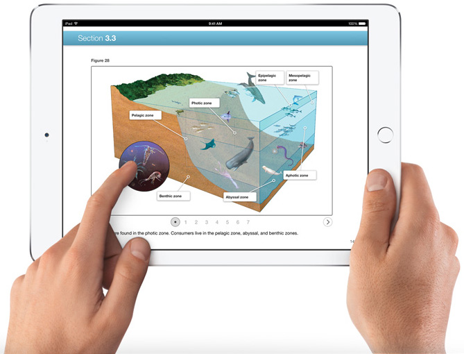
Readers can then tap on particular parts of the image (which can even be made 3D so they can change the angle, zoom in and out, and the like) to draw up a pop-up box with in-depth text specific to that part. Not everyone learns best through text on its own, so this is also an ideal opportunity to embed a video or a radio snippet instead. One of the excellent things about interactive ebooks is that you can either have text on its own or simply the video or combine both at the same time.
This puts information literally at a user’s fingertips, allowing readers to now have the option to draw up the text or video as they wish. Combining text and video is also a great way to shake things up, and use various media to give information, especially if what you’re creating is a textbook.
Information and ideas that are available at the tap of a finger give readers the scope to deal and interact with their ebooks in a more interactive way. Think along the lines of a map with clickable locations showing the hero’s journey – this could work with Harry Potter, for instance, or even The Lord of the Rings trilogy.
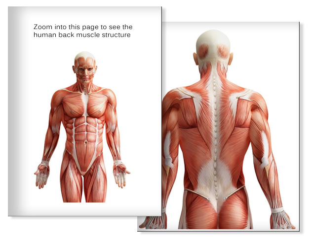
This is particularly useful for educational ebooks. A sample ebook we had created in the past, involves a diagram of the human body structure, which once zoomed in, will show the structure from the back.

Struggling to make your work more interactive as well as informative? This article on how to create an interactive ebook will help.
2. Search assisting tools
Ebooks so far have a plain and simple search panel that allows you to type in the search parameters. This then brings up every incidence of the keywords in chronological order. But they are hard to use, and you can’t always get back to your original reading position afterward. Remember, readers don’t have the benefit of using bookmarks or fingers to keep their place.
One way to make searches more usable is to let readers sort by relevance – iPad textbook publishers, such as Inkling, have created searches using tabs. For easier navigation, each tab at the top of the page is organized depending on relevance, content order (where the content happens), and type (whether it’s audio or text). There are also tabs at the bottom that allow readers to switch between searches and the text being read.
With multi-touch ebooks, you can go even further with the creativity of innovative search tools. This includes internal links to other relevant sections of the ebook, which will increase how the ebooks are organized and the book’s reading flow.
In the case of apps such as Martha Stewart‘s Cookie ebook, you can even use search wheels. The search wheels can be spun around to match together different search terms. You can have plenty of fun exploring the combination of two different search items, whether they are key ingredients or important search parameters.
You can also create a moving circle of pictures or chapters – think of a play on the use of “art circles”, where images relating to specific topics move around in a circular motion. The chapter headings or images will enlarge as the circle moves, enough for users to read the text – and on which the reader can tap to go straight to the section they want. This is a great idea if you’re dealing with art-related topics, where a more innovative layout works well.
This allows readers to explore the book in whatever order they want and in whatever depth. This is where visual clues such as animations (which we’ll get to in the next point) work well in pointing readers toward how to delve deeper if they wish.
Expandable and collapsible nested bookmarks can also be used so long as the titles are user-friendly and relate to the content. This entails descriptive titles that can be clicked on to take the reader straight to the desired page. Under each main bookmark, you can create a hierarchy of “daughter” bookmarks, which can be also be clicked on to take the reader to related content. This article explains how to use MS Word to create a linked table of contents for Kindle ebooks.
3. Interactive Additions
A major gripe bookworms had when ebooks started to make an impact, was that they did not have the same ‘feel’ as their printed counterparts. Ebooks, it was claimed, didn’t gain that well-loved look when they were read again and again. A big bonus with interactive ebooks, however, is their flexibility to include elements that improve on the reading experience.
Not only can you add movable pictures (which we’ll get to in the next point) you can also add interactive elements. These include images that change as the storyline develops or according to how much the book is used, as well as voice control.
Take, for instance, cookbooks, which, in printed form, easily get stained and messy when used in the kitchen. In ebook form, you can create the same effect. Each time the user opens up a recipe page, you can create cup stains that darken every time you turn to that page, or add a splodge from an ingredient – or even create a “well-thumbed” effect with rumpled pages.
This gives the same effect as a traditionally printed book and gives readers the same feeling that they are using recipes on a frequent basis. The vast majority of graphics for websites, as well as books, are created in software such as Illustrator or Photoshop. If you’re not too hot on the software skills, there are websites where you can download images and vectors that can be embedded in the text. Also, you can read this article on how to optimize images for ebooks.
Even though they’re not printed, interactive books are a great way to get creative in showing how much your book is used (and loved!). This is where scrollable infographics and hyperlinks or images can be used – readers can shift around the book according to what information they want to take at that moment.
Lonely Planet’s travel ebooks are excellent examples of how ebooks use scrolling capabilities for readers to easily navigate their way around. You can learn how to add a scrolling frame in FXL or Publish Online from this article.

You can also add sensors within the ebook to enhance the experience, and this includes voice control. Users can activate the voice control through their device settings, which link up with the ebook. This is particularly useful for readers with physical disabilities – to be able to use voice or movement commands can help bring up books, turn pages, and search. Apps such as Sesame Reader (which can be accessed via your app store, and covers all devices) allow readers to change pages or go to new destinations through movement of the body rather than touch.
An excellent addition to any ebook are interactive infographics – here you can find 8 pro tips for creating them.
4. Using moving images
It’s a well-established fact that digital books are a great way to use moving images. But a big question is: How far can you go with moving images? The very simple answer is: Don’t overdo the moving images! Animated images are a great way to attract a reader’s attention. But if you make an animation continually moving through scenes, making the text irrelevant, it becomes more a film than a book. The more subtle the animation is, the less distracting it is.
Although not in ebooks, a classic example of the beginnings of this can be found in the Microsoft Word animated guides (remember Clippy?). When you opened up Microsoft Word, he’d move around the page with pop-out speech bubbles guiding the user through the set-up process. The guide will also occasionally blink and move to remind the user they are still there to answer questions. This is just a very simple example of how this interactivity can be used.

The idea in interactive ebooks is to incorporate images that move around the page and through the book. This all happens around certain limitations to how far and how much the animations move. They will be relevant to the text itself, demonstrating and illustrating the important parts (as well as adding humorous elements).
In interactive ebooks, it can be taken one step further – animations can gain transformative qualities using CSS software (which is what most ebook creators will use). Images can also take on transitional elements. In this way, they can have various sub-images that make their own appearance from different directions to complete the original image. Graphs and charts can be animated, filling themselves in according to what stage you have reached, or “self-drawing” at the tap of a finger on the screen. Even page turning can be animated, to give it the look of a real printed book. An easy-to-follow introduction and overview of how to create animations in digital ebooks can be found in our article about animation techniques for ebooks as well as in this article by Creative Bloq.
There’s also plenty of software out there if you’re looking to create really awesome animations to go with your books. Check out this article for examples of animation software, or these 9 tools for creating great animations.
5. Audio soundscapes
An audio soundscape works as a musical “background”, or added sound effects running in conjunction with the text. It is the audio element that provides a more immersive aspect to the reading experience.
For instance, if a character attends a ball, you’ll be able to hear the noise of fellow dancers and music in the background; if they attend a tea party in a garden, you’ll be able to hear the chink of china and pouring of tea as they go through their motions. Salman Rushdie‘s set of essays “In the South”, published in 2012, came with a full orchestral score performed by the New Zealand Symphony Orchestra.
Don’t confuse this with audio narration which has already been embedded into many ebooks. Audio narration is simply a “reading” tool, or “text-to-speech” application, which verbalizes the words on the “page”.
Even if you do prefer reading in near-silent conditions, the added sound effects can really help bring the story to life outside of the page without having to go watch the film. For the better part of 7 years, New York-based company Booktrack has released books with added music, soundtracks (and even specific sound effects) that run synchronized to the place in the text.
There are other websites out there where you can create your own soundscape, more background music, to go with the ebook, including Wild Music: Build a Soundscape, Ambient Mixer or Soundscape Generator
If you’re looking simply to download free soundscapes, you can go to websites such as Sample Phonics and Freesound.org.
A little bonus
Do you have tons of articles, essays, and blog posts that you want to convert into interactive ebooks? It’s a better way to go than to start creating ebooks from scratch if you already have content.
There is an abundance of websites you can use to convert your written text into interactive ebooks. Not all are free, but the fact they are so easily accessible illustrates just how much easier it is to get published. To highlight just a few websites:
iBooks Author (discontinued in 2020)
These examples aside, the internet is now awash with websites that have evolved over the past decade giving freely available advice. This is particularly useful for authors looking to create their own interactive ebooks, particularly for multi-touch devices. It’s no longer the case that the page constrains you – the whole world is at your fingertips too!
You might also enjoy:
How to create an interactive ebook: a step-by-step guide
Book Widgets: Everything You Need to Know
How to edit EPUB books manually


