8 Ebook Design Tips from Professional Designers
As an author, you probably want your ebook to look perfect, especially after putting so much time and effort into writing it. Ideally, you’ll hire a designer to add some aesthetic touches and make it look professional. But what if you’re on a budget and hiring a designer isn’t something you’re able to do?!
Well, you can actually do it yourself and achieve some great results. To help you do that, we’ve asked our amazing design team and they’ve provided us with some essential ebook design tips that we’re going to share with you in this article. Following and applying these tips is a sure way to save money and get yourself a captivating and professional-looking ebook.

Why You Should Care About the Design of Your Ebook?
It’s true that the text is usually the most important aspect of any book. However, your ebook design can have a huge impact on its sales. And that’s not all! There are many other important factors that are affected by your ebook design, including:
- Reading Experience: Good ebook design enhances the overall reading experience by making it easy for readers to navigate and interact with your content. This in turn can improve their overall satisfaction.
- Readability: Optimizing your ebook readability can be achieved by adding various design elements. For example, your choice of font type and size, line spacing, and layout formatting impact how easily your readers can browse the text.
- Visual Appeal: The design of your ebook can greatly influence how it attracts potential readers. Thoughtful color choices, typography, graphics, and images can enhance the overall aesthetics of the ebook. They can also make it visually appealing, thereby increasing the likelihood of reader engagement.
- Branding and Identity: If you are an author, a publisher, or a business owner, the design of your ebook can contribute to building your brand identity. Consistent design elements can help reinforce your brand’s image and create a recognizable identity across different publications. They can also help establish credibility and trust among your readers.
- Accessibility: Accessibility in design is essential for inclusivity, and it allows a broader range of readers to engage with your content. Design choices that accommodate individuals with visual impairments ensure accessibility and enjoyment for people with different needs. These choices include adjustable font sizes, alternative text for images, and proper text-to-background contrast.
Tips for Designing Your Ebook Like a Pro
Designing an ebook requires careful attention to various elements to ensure a cohesive and visually appealing final product. For that reason, we’ve gathered some important tips that can help you captivate your readers.
1. Determine the Purpose and Target Audience of Your Ebook

Before diving into the design process, it’s crucial to define the purpose of your ebook and identify your target audience. Understanding the goals and target readership will guide your design decisions, ensuring your ebook meets their expectations and interests.
Consider whether your ebook aims to educate, entertain, inform, persuade, or solve a specific problem for your readers. This will help you structure the content and design elements in a way that effectively communicates your message and achieves your intended goals.
As for the target audience, understanding who they are is vital for creating a tailored ebook design that resonates with them. Think about their demographics such as age, gender, occupation, interests, and any specific characteristics that define them. Clearly identifying your audience can help you better align the design elements and visual aesthetics of your ebook to match their preferences and engage them effectively.
For example, let’s look at how the design of children’s books differs from that of cookbooks. As children are usually visual learners who love to engage with what they read, their books need to include colorful illustrations that bring the story to life. Cookbooks, on the other hand, need to include easy-to-read recipes with visually appealing food photos.
2. Design an Eye-Catching Book Cover
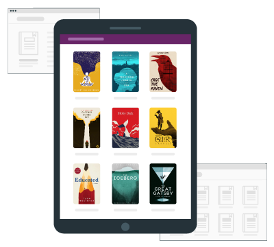
Your ebook cover is the first point of contact for potential readers. It serves as a visual representation of your content and creates an initial impression that can make them curious about what lies inside. When you have a well-designed cover, it will capture the attention of your target audience and compel them to explore further.
Another thing to keep in mind is that a well-designed and professionally made cover conveys a sense of quality and credibility. It shows that you have invested time and effort in creating a polished product, which can enhance your readers’ trust and perception of the ebook’s value.
In order to create an eye-catching book cover, here are some important tips:
- The book cover should be visually appealing, using colors, typography, and imagery that align with the theme, genre, or mood of your ebook. Whether it’s a thrilling mystery, a heartwarming romance, or a thought-provoking non-fiction book, the cover should be in harmony with the overall concept of your book and appeal to your target readers.
- If you have an established author brand or you have published your own book series, the cover design should be visually consistent to create a recognizable and cohesive identity. This will allow the readers to associate your ebook with your author name or your book series, making it easier for them to find and connect with your work.
- Research bestselling ebooks in your genre or niche to understand the visual trends that resonate with your target readers. By aligning your cover design with their aesthetic preferences, you increase the likelihood of attracting the right audience and motivating them to explore your ebook further.
Read more: 9 Ebook Cover Tips for Beginners
3. Choose an Intuitive Layout and Structure
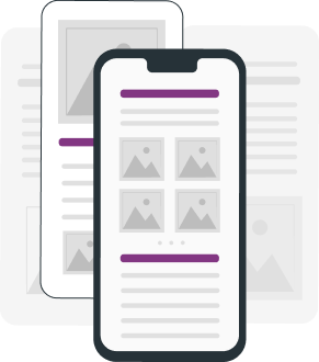
A well-organized ebook layout makes it easier for the readers to navigate through your book. That’s why it should be well-structured, enabling readers to follow along with the ebook’s content and easily identify and access important information.
This can be done through a number of elements, such as:
- Incorporating a clear visual hierarchy: Utilize elements such as headers, pull quotes, and sidebars to highlight key insights. You should also include clear chapter titles, page numbers, and a clickable table of contents to allow readers to quickly jump to specific sections or chapters. Including H1, H2, and normal text can help in distinguishing headings, subheadings, and body text. This can help create visual distinctions and enable your readers to scan and skim the content, locating relevant sections or key points easily.
- Consistent Layout: Maintain consistency in the layout and formatting throughout your ebook. Use the same fonts, font sizes, and color schemes to create a cohesive design. Consistency helps readers develop familiarity with the structure, making it easier for them to navigate and absorb information. It also adds a professional touch to your ebook’s design.
- Readability: Pay attention to the readability of your ebook by choosing suitable paragraph lengths and breaking up large blocks of text into smaller paragraphs so it becomes easier to read. Moreover, try to incorporate white space between paragraphs or sections to give your readers’ eyes a rest.
- Reflowable/Fixed Layout: Decide whether a reflowable or fixed layout is most appropriate for your ebook. A reflowable layout allows the content to adapt to different screen sizes and orientations, providing a consistent reading experience across devices. A fixed layout, on the other hand, maintains a precise positioning of text and images, which makes it ideal for complex designs or image-heavy ebooks such as children’s ebooks or comic books.
If you’re not comfortable designing the layout from scratch, consider using a pre-made template. Many ebook creators, such as Kotobee Author, offer ebook templates that you can customize with your own content.

4. Optimize the Color Palette

Selecting an appropriate color palette is vital for enhancing the overall aesthetics as well as the reading experience of your ebook. Here’s what you should consider while selecting a palette for your design:
- Setting the Right Tone: The color palette you choose plays a crucial role in setting the tone and atmosphere of your ebook. Different colors evoke specific emotions and associations. For example, warm colors like red or orange can create a sense of energy or urgency, while cool colors like blue or green can convey a calming or professional tone. So consider the intended mood of your ebook and select colors accordingly.
- Topic Relevance: Aligning the color scheme with the content helps create visual coherence and enhances the reader’s connection with the material. For instance, a nature-themed ebook might incorporate earthy tones, while a technology-focused ebook might feature a sleek and modern color palette.
- Balance and Harmony: Maintain a balanced visual presentation by using one or two dominant colors and two to three accent colors, as too many colors can create a chaotic or overwhelming appearance. Dominant colors should be used for main elements like headers, backgrounds, or section dividers, while accent colors can be employed for buttons, icons, or call-to-action elements. And don’t forget to consider the contrast between colors to ensure readability and visual clarity.
- Grabbing Attention: Utilize contrasting colors strategically to make important information stand out and grab readers’ attention. For example, use a bold or vibrant color for headings or key points to make them visually prominent. This contrast helps guide readers’ focus and highlights essential elements within the ebook.
- Reflecting Brand Identity: If you are writing a nonfiction ebook and you have an established brand identity, incorporating your brand colors into the ebook design can help maintain consistency and strengthen brand recognition. Utilize the colors that are associated with your brand logo, website, or other marketing materials. This not only creates a cohesive visual experience but also reinforces your brand identity in the minds of readers.
- Accessibility Considerations: Keep accessibility in mind when selecting colors. One way to make your design more accessibility friendly is by ensuring there is sufficient contrast between text and background colors, which will make the content readable, especially for individuals with visual impairments. Online color contrast checkers can help you comply with accessibility standards.
5. Choose Fonts and Font Sizes
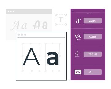
Font selection plays a crucial role in the legibility and visual appeal of your ebook. A well-selected font helps convey your message effectively and engages readers with your ebook. Take into consideration the following factors:
- Legibility: The choice of fonts significantly impacts the legibility of your ebook. That’s why you should go for easy-to-read fonts that are clear and distinguishable, ensuring that readers can comfortably move through the text. Choose fonts that have a balanced ratio of stroke thickness, letter spacing, and letterforms that are not too ornate or complicated. Fonts like Arial, Helvetica, or Roboto are commonly used for digital reading due to their simplicity and clarity.
- Tone and Style Alignment: Pick fonts that align with the tone and style of your content. Different fonts evoke different moods and convey various levels of formality. For instance, a sans-serif font might be more suitable for a modern or casual ebook, while a serif font could lend a more traditional or elegant feel.
- Consistency and Coherence: Limit the number of fonts in your ebook to 3 or 4 to maintain consistency and coherence; using too many fonts can create visual clutter and distract readers from the content. You can choose a primary font for the body text, a complementary font for headings or subheadings, and possibly a different font for special elements like quotes or captions. Just make sure that the fonts you choose look good together and are readable in different sizes.
- Readability Across Devices: Keep in mind that your ebook may be read on various devices with different screen sizes. That’s why you should select font sizes appropriately to ensure that the text remains readable across different devices. The font size for body text should generally be between 10 and 12 points for optimal readability. You can, however, make some adjustments to the headings, subheadings, or quotes to maintain a visually balanced hierarchy.
6. Enhance with Relevant Visuals
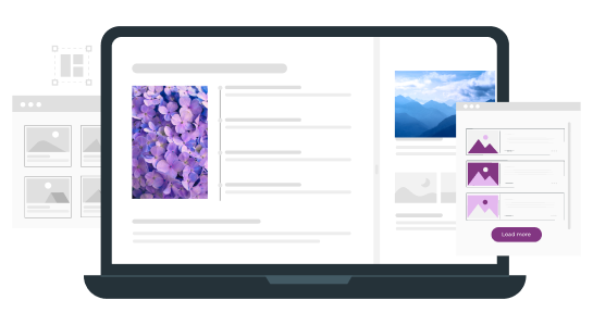
Visuals play an important role in ebook design. But including ones that aren’t relevant or of bad quality can negatively affect the reading experience. So in order to keep your visuals relevant and engaging, try to follow these tips:
- Break Up Lengthy Text: Lengthy blocks of text can be overwhelming for readers and may discourage engagement. That’s why it’s important to incorporate high-quality images and graphics that help break up the text. By distributing the visuals strategically, it becomes easier for your readers to navigate your ebook.
- Stay Relevant to the Content: The visuals you include in your ebook should provide value and support the information being shared. They should also enhance the reader’s understanding and complement the text. If you’re explaining a process or providing step-by-step instructions, for example, consider using diagrams, flowcharts, or illustrations that visually represent the concepts being discussed.
- Keep the Illustration and Imagery Style Consistent: To maintain a polished look, aim for a consistent illustration or imagery style throughout your ebook. This helps create a cohesive visual experience for the reader and reinforces your ebook’s branding or aesthetic.
- Avoid Visual Clutter: While placing visuals in your ebook, remember to avoid visual clutter. Try to use these visuals purposefully and focus on quality over quantity, as overloading your ebook with too many visuals can distract or overwhelm the readers.
- Customize Stock Photos: Stock photos can be a valuable resource, but sometimes they may lack originality. To avoid this problem, consider editing them by applying filters, cropping, or adding relevant elements that make them unique and align with your ebook’s overall aesthetics.
- Give Proper Attribution and Licensing: When using visuals from external sources, it’s important to adhere to proper attribution and licensing guidelines. That’s why you need to have the necessary rights and permissions to use the visuals in your ebook. This protects you from copyright infringements.
7. Add Interactive Elements and Multimedia

When used correctly, including interactive features and multimedia elements can elevate your readers’ experience. By incorporating videos, audio clips, animations, or ebook apps that complement the content of your ebook, you will make it much more captivating.
Just as with the rest of your visuals, the interactive elements you include in your ebook can serve many purposes. First of all, including interactive and multimedia elements takes your ebook to the next level by making your readers engage with the content. They can provide additional context, demonstrate important concepts, or offer supplementary information. They also engage multiple senses and cater to different learning styles.
When choosing interactive elements and multimedia, ensure that they align with and enhance the content of your ebook. For instance, if you’re explaining a complex procedure or demonstrating a technique, incorporating a video tutorial can be highly effective. Ebook apps, such as flashcards or games, can also help readers actively engage with the content and better grasp the information. The key here is to select the interactive elements that provide value and reinforce the main message or learning objectives of your ebook.
More importantly, don’t forget to consider the technical aspects of your ebook; ensure that the file size of your ebook remains manageable, especially if you’re including large multimedia files. Compressing videos and optimizing audio files can help maintain a reasonable file size without compromising quality. Additionally, try to test and preview these interactive elements across different devices and platforms to ensure they function properly before publishing your ebook.
8. Optimize for Mobile Devices
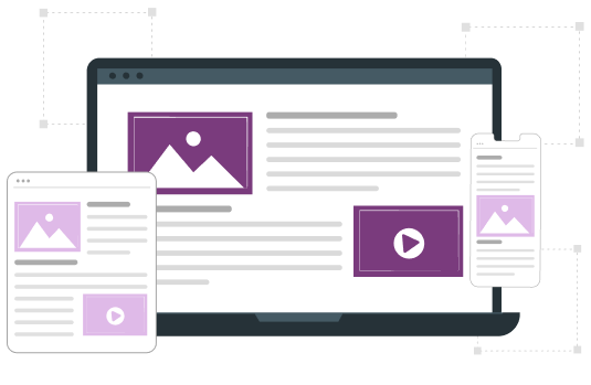
In today’s digital world where most people use their mobile phones to complete many tasks, it’s important to optimize your ebook to be viewed on such devices. By doing so, you’ll expand its reach to a wider audience and cater to the preferences of readers who like to access content on the go.
To optimize your ebook for mobile devices, it’s essential to implement a responsive design that adapts to various screen sizes and resolutions. You also need to prioritize simplicity and ease of use by keeping the layout clean and uncluttered. Simplifying the user interface can also reduce distractions and facilitate seamless navigation for your readers.
Useful Tools for Ebook Design
Now that we’ve covered the most important tips regarding designing your ebook, let’s take a look at some tools that can help facilitate the process. These tools will also help you create a professional-looking ebook that is visually appealing to your audience.
- Adobe Color: This is a free online tool that helps you create and explore color palettes. You can use it to generate harmonious color schemes and export them for use in your ebook design.
- Google Fonts: If you’re looking for some free fonts for your ebook, then you’ll find on Google Fonts a vast collection. You can browse through different styles, preview them, and easily integrate them into your project.
- Unsplash: On this popular platform, you can find a variety of high-quality stock photos. It has an extensive library from which you can download images for your ebook.
- Pixlr: In order to make adjustments to stock photos (or any other visuals), use this tool to add filters and apply various effects.
- Inkscape: Inkscape is a free vector graphics editor that allows you to create and edit vector-based illustrations and designs. It is a useful tool for creating logos, icons, and other graphical elements.
- Reshot: This platform focuses on providing visually appealing images and illustrations that can add depth and creativity to your ebook. You can search for specific themes, subjects, or styles to find the perfect images to complement your content and design.
- Behance: If you want some inspiration for your ebook design or cover, then Behance can be a great resource. It allows you to explore a vast collection of stunning designs and gain valuable insights from talented artists and designers worldwide.
Design Your Ebook with Kotobee
When it comes to creating visually stunning ebooks, Kotobee Author can provide you with a comprehensive set of design tools and features. It gives you full control over the design of your ebook, allowing you to craft a unique reading experience for your audience. You can easily customize the ebook’s appearance by selecting from a wide range of pre-designed templates or by creating your own design from scratch.
As for those seeking professional assistance, Kotobee also offers a dedicated ebook designing service. By collaborating with experienced designers, you’ll be able to bring your vision to life. From concept development to the final design touches, Kotobee ensures that your ebook stands out with its aesthetics and functionality.
Final Thoughts
Designing an ebook involves various considerations to create a visually appealing and user-friendly product. By following the tips mentioned in this article, you can create an ebook that resonates with your target audience. Just remember to maintain consistency in design elements, choose relevant visuals, and incorporate interactive elements wisely.
.
Read More
How to Create an Interactive Ebook: A Step-by-Step Guide
Your 6-Step-Guide to Building an Author Website
Ebook Branding: How and Why to Do It


