Best Fonts for Ebooks in 2026: A Guide for Authors in the Digital Era
If you’ve ever published an ebook before, then you’re probably aware that there’s so much that goes into the designing process. From creating the front cover to choosing a suitable layout, it can get overwhelming. But one important element of design that often gets overlooked is the ebook font you use.
And while there are probably thousands of fonts out there that might leave you confused as to which to choose, there’s no need to worry; we have got you covered! In this article, we’ll explore the best fonts for ebooks, and how to choose the right one for you.
Why Selecting the Right Ebook Font Matter?
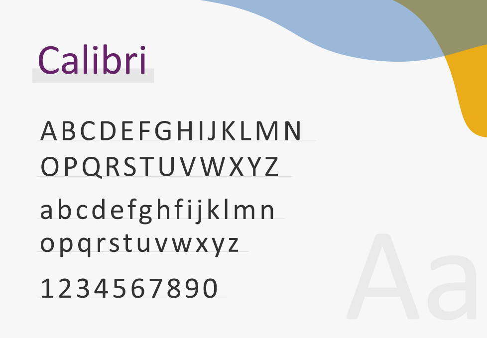
Even though some people choose to go with the default fonts (e.g. Calibri or Arial), selecting the right ones for your ebook can have a huge impact on many elements, including:
- Readability and comprehension: The main goal of any font is to make the text readable. If the font you’re using isn’t clear enough, your readers might not be able to understand the content of your ebook. That’s why selecting the right font can increase legibility and ensure that the readers can absorb the content without unnecessary effort.
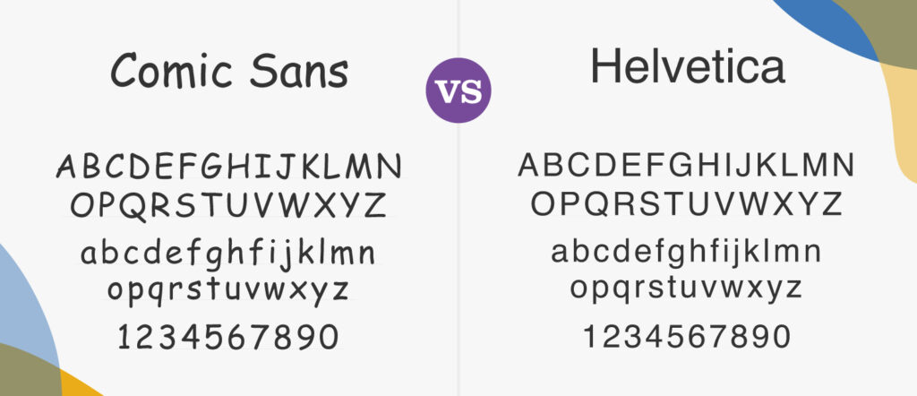
- Visual appeal and engagement: Selecting the right font can add to the overall visual appeal of your ebook. It can also increase reader engagement and convey the tone of your content in a subtle way. For example, some fonts (like Comic Sans) may appear playful and light, while others can look more professional (such as Hevicta).
- Accessibility: While choosing a font for your ebook, it’s important to keep the visually impaired and dyslexic readers in mind. Including small fonts or ones with intricate designs can be difficult for them to read. Instead, go for fonts that aren’t overly decorative to ensure that each individual letter is recognizable.
- Brand recognition: Selecting the same font for your ebooks as the one you use in your other branding materials (if applicable) can help create a coherent visual identity that resonates with your readers. This brand recognition can help foster brand loyalty by creating an emotional attachment to your content.
What Are the Different Kinds of Fonts?
As we mentioned earlier, choosing the kind of font can depend hugely on the content of your ebook. But to better understand the difference between each type, let’s take a quick look at what each of them means:
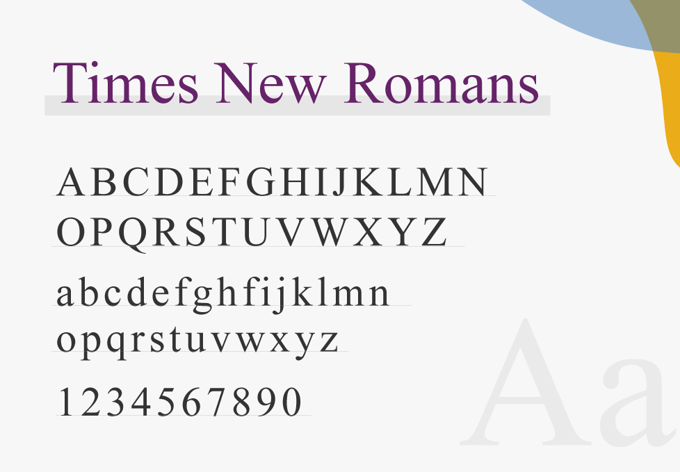
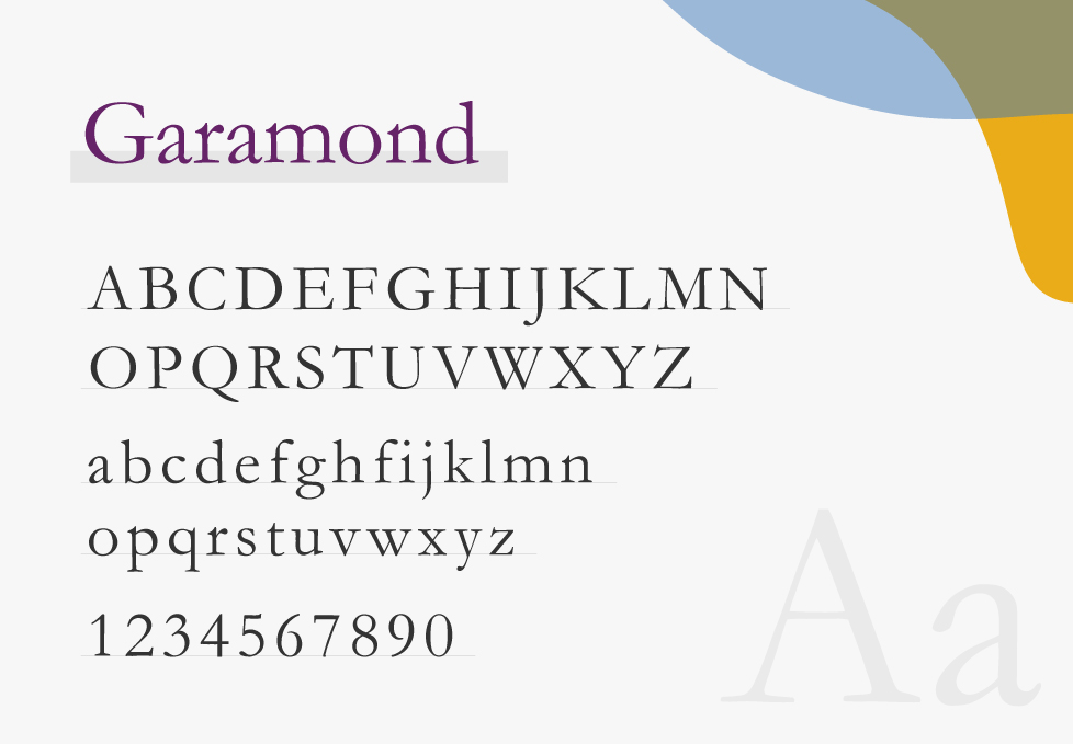
- Serif fonts: These types of fonts tend to be more decorative, with tails or small strokes at the end of the letters. Some designers believe that these strokes help guide readers from one letter to the next. Moreover, these fonts are usually seen as elegant and sometimes playful. Examples include Times New Roman, Georgia, and Garamond.
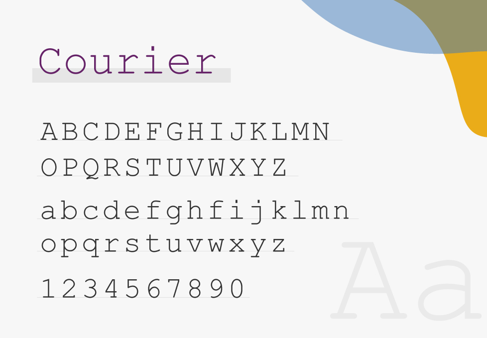
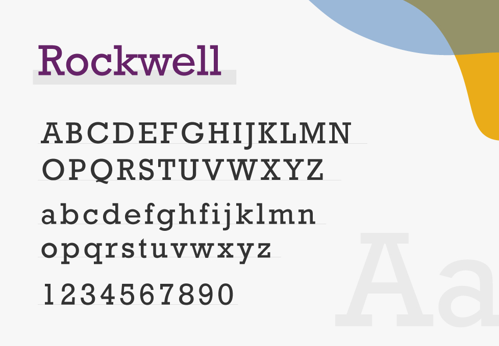
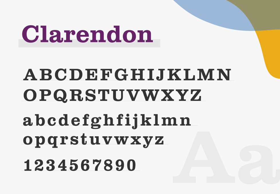
- One variation of this type of font is known as the Slab Serif, which was designed to withstand the industrial printing processes. These fonts have thicker strokes and appear to be more bold. They are often used in branding and advertising. Examples include Rockwell, Courier, and Clarendon.
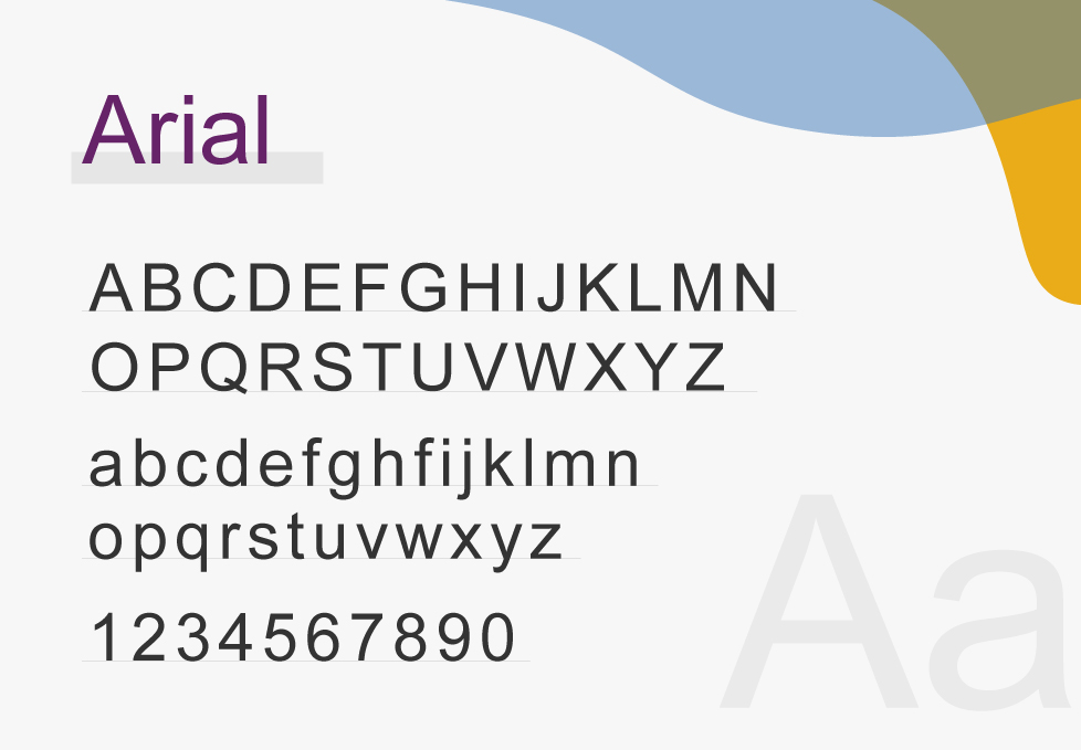
- Sans serif fonts: Unlike serif fonts, these ones tend to be clearer and sharper, so that you won’t mistake one character for another. Thus, they are considered to be more professional and formal. Examples include Arial, Helvetica, and Calibri.


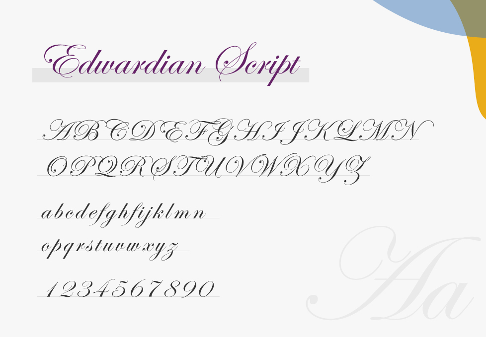
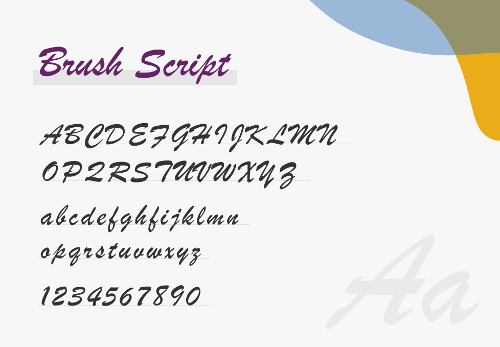
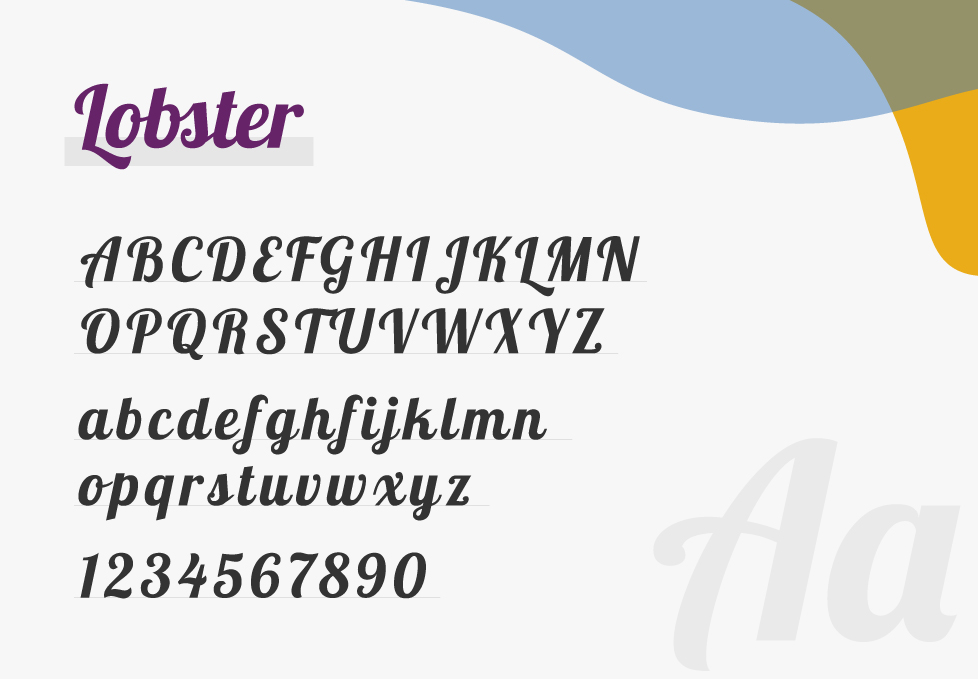
- Script fonts: Have you ever seen a digital font that feels like a beautiful hand-written script? Well, these fonts are known for their artistic style, as the characters appear to be flowing and cursive. Examples include Edwardian Script, Brush Script, and Lobster.
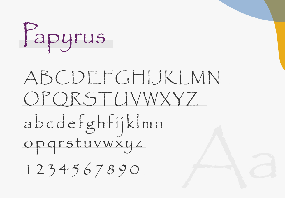
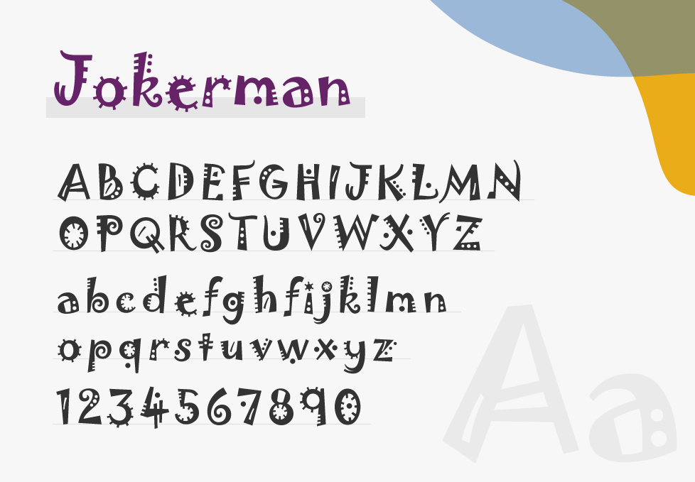
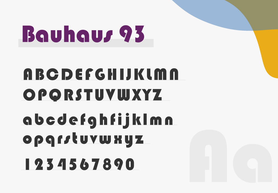
- Display fonts: Display fonts are highly stylized and are often used for decorative or artistic purposes. They can be thematic or abstract in design and are not typically used for long paragraphs of text, but rather for headlines, banners, and large text. Examples include Papyrus, Jokerman, and Bauhaus 93.
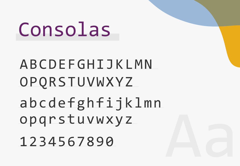
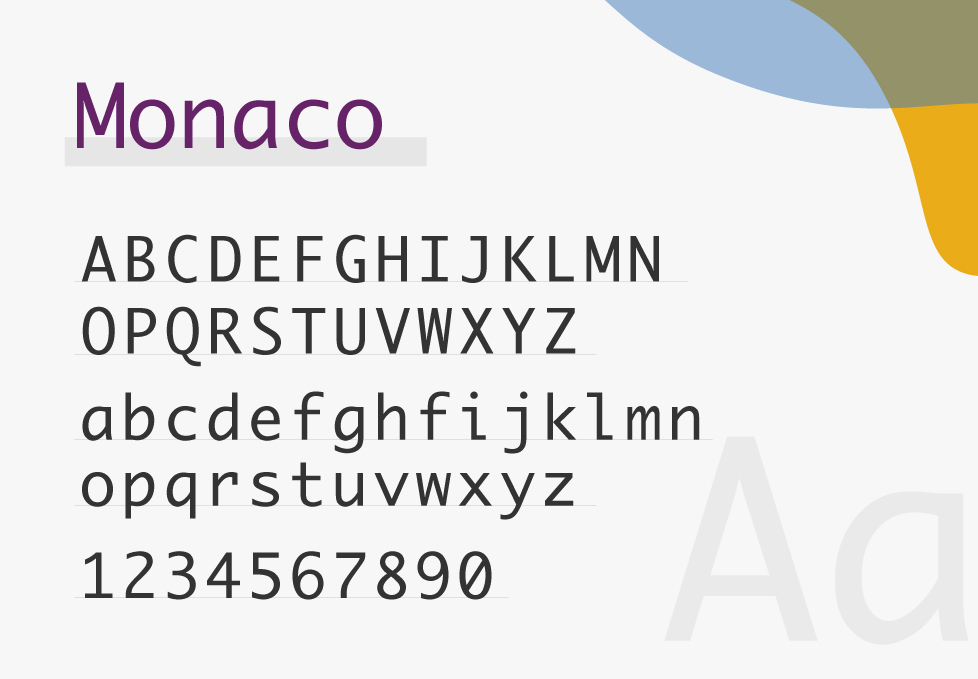
- Monospaced fonts: First appeared in the typewriter days, each character in the monospaced fonts had to occupy the same horizontal space for mechanical reasons. These fonts are still popular today for coding, tabulation, and some print and online media sections. Examples include Courier, Consolas, and Monaco.
How to Select the Right Font for Your Ebook?
Now that you know how different fonts can affect the success of your ebook, let’s move to the things you need to keep in mind while selecting one:
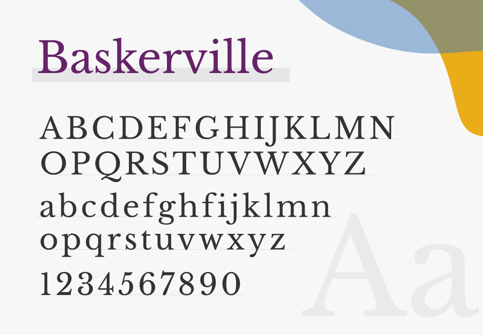
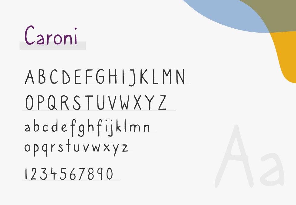
- Think of your ebook’s genre, tone, and target audience. If you are writing a children’s ebook, for example, you can use fonts that are more playful yet easy to read, such as Caroni. But if you are working on employee training materials or a textbook, you might want to stay with more formal fonts, like Baskerville.
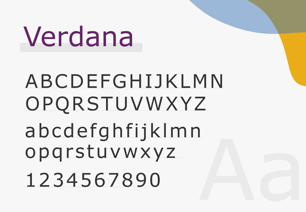
- For better readability, choose a font that contrasts sharply with the background of your ebook, such as Verdana. Also, make sure that it has enough thickness to increase its legibility and make it easier for the reader’s eyes to track the lines of text.
- Check its compatibility with different devices and how it appears on various screen sizes.
- If your ebook is text-heavy, it’s much better to opt for clear easy-to-read fonts. But if your ebook relies less on text and more on images or other interactive elements, then you can go for more decorative fonts.
- Ensure that your font of choice supports a wide range of characters, including special symbols (such as Arial). This is especially important if your ebook is multilingual or includes technical terms.
- If you are using a custom font, make sure you have the right to its digital distribution so you don’t face any legal issues after publishing.
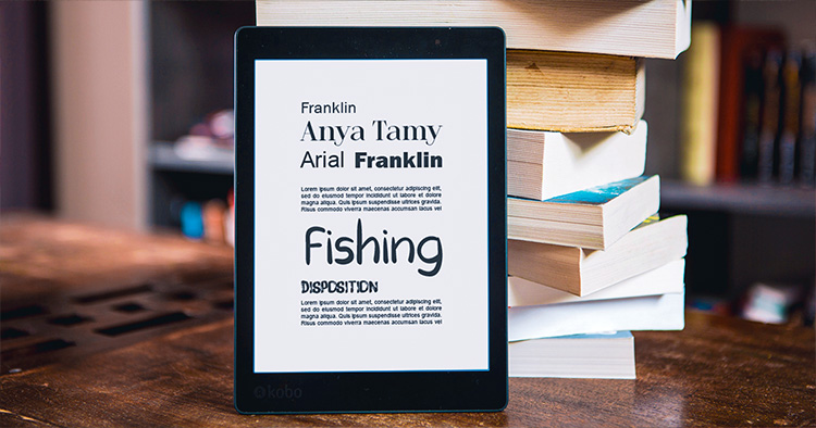
Best Fonts for Ebooks
While some people prefer to use only one font throughout their ebooks, others opt for using one for the headings and another for the body text. The choice is yours of course, but if you decide to go with the first option, then try to select a font that is clear and simple. But if you choose the second option, then you can find below some suggestions for both headings and body text fonts that would make your ebook more engaging.
Best Fonts for Headings
When choosing fonts for your titles, headings, and subheadings, you can go with slightly decorative ones that grab the readers’ attention. While keeping the tone of your ebook in mind, serif and display fonts can do a great job in this regard. And since the headings are usually in a larger font, there won’t be any readability issues if you choose these typefaces. Let us give you some examples:
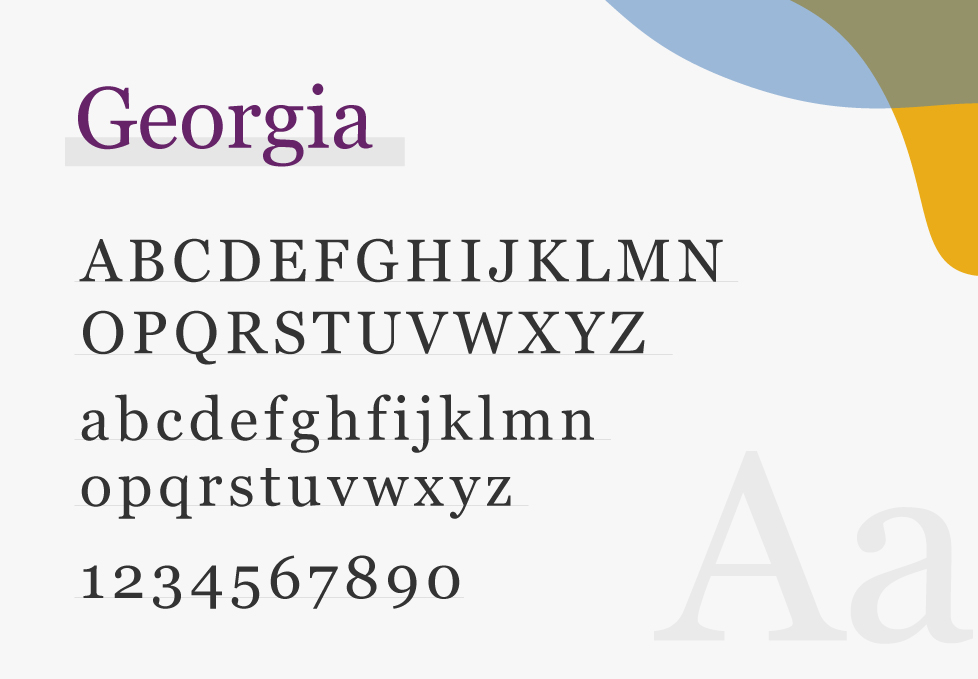
- Georgia: Specially designed for digital text, Georgia font has a formal yet charming look. It is also very well known for being one of the best fonts for reading books, even on lower-resolution screens.

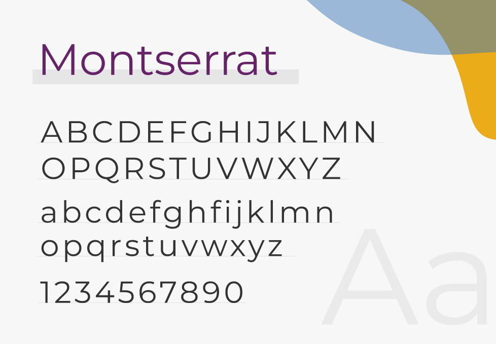
- Montserrat: Because of its bold and modern look, Montserrat is often used in headlines and titles. Its design was inspired by the signs and posters in the Montserrat neighborhood of Buenos Aires, and it has a large x-height that makes it perfect for grabbing your readers’ attention.
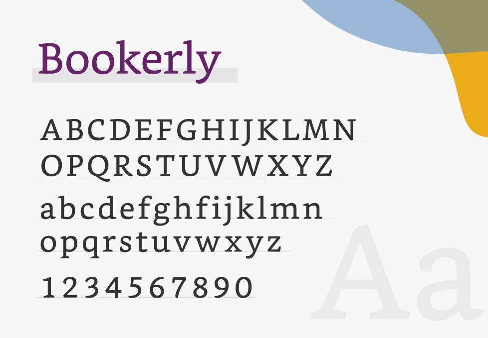
- Bookerly: Bookerly is one of the new Kindle fonts that are used in e-readers and apps. It has a contemporary look, with balanced spacing, elegant curves, and subtle details. And the fact that it is designed specifically for digital reading makes it excellent for readability.
- Baskerville: As a traditional serif font, Baskerville is both elegant and highly readable, even when it is set at a small size. This is mainly due to its crisp edges, high contrast, and spacious proportions.

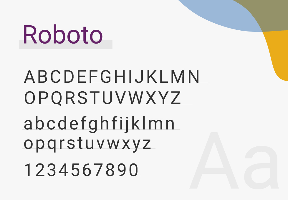
- Roboto: Roboto is a modern and versatile sans-serif font, that offers a friendly and approachable feel. It’s designed for screen use and comes in various weights, making it suitable for different heading styles.
- Caroni: This is one of the best fonts for children’s books; with its laidback design, it feels like a handwritten script that is perfect for use in different media.
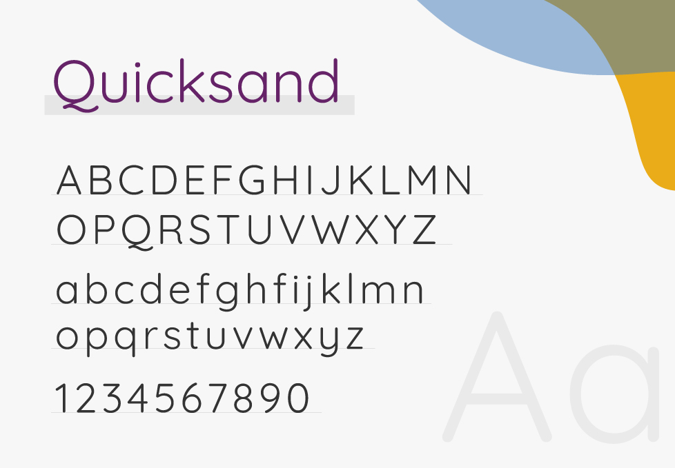
- Quicksand: This font has a rounded design that makes it fun yet easy to read for both kids and adults. It’s perfect for adding a friendly and informal feel to your ebooks.
Best Fonts for Body Text
Since the majority of ebooks usually consist of body text, you want to select a font that’s clear enough and easy to read. You also have to keep in mind that the resolution of the font might be affected by the different screen sizes. That’s why it’s better here to choose a clearer sans-serif font.
- Arial: Probably the most widely used font for body text, Arial is usually the default font in many word processing software, such as Google Docs. This could mainly be because it is an extremely versatile font that is good for readability and can be used in ebooks, elearning materials, and digital publishing in general.

- Verdana: Designed by Matthew Carter for Microsoft Corporation, this is one of the most popular fonts for screen reading. As a sans serif font, it is legible in small size and doesn’t have any strokes or tails, which makes it easy on the eyes for text-heavy ebooks.
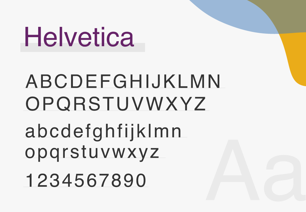
- Helvetica: Used by many famous organizations (including Apple, NASA, and BMW), Helvetica has a clean and simple look. It is also known to be one of the most used fonts in thriller and crime mystery ebooks.
- Roboto: Designed by Google, Roboto has a mechanical skeleton with largely geometric forms. It also features friendly and open curves, providing a more natural reading rhythm.

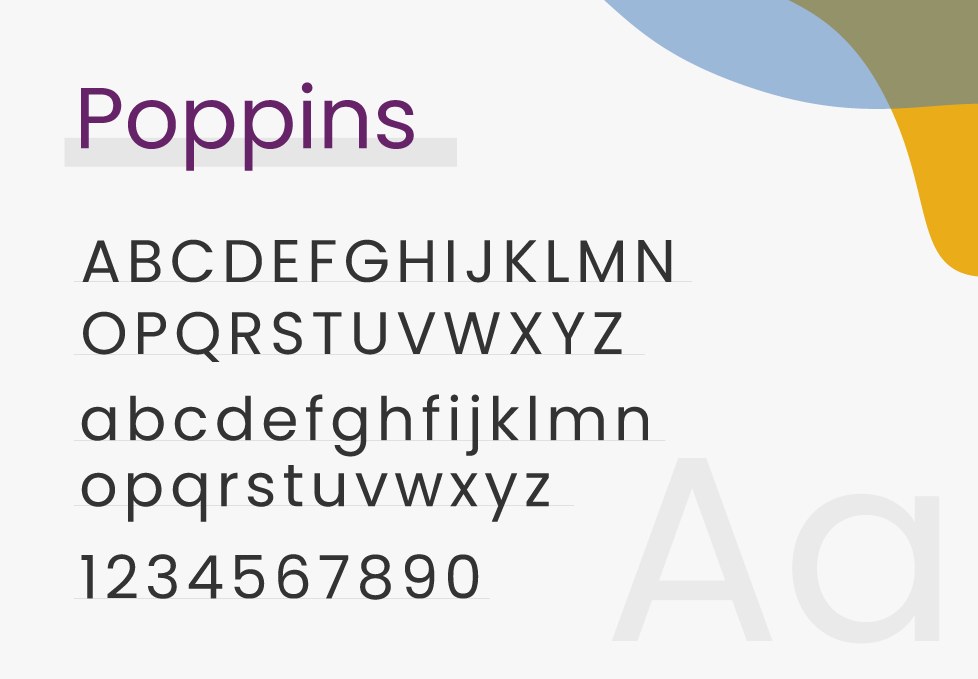
- Poppins: This font is a geometrical sans serif that is also perfect for the body text of your ebook! With elegant curves and sharp corners, Poppins can give your ebook design the edge you need.
- Calibri: As a famous sans serif font, Calibri is widely used because of its distinguished characters and ease of readability. Whether you are working on a business proposal or some marketing materials, this font can surely make your content look neat and professional.
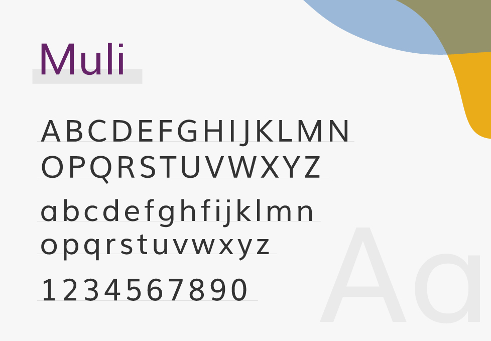
- Muli: Muli features a modern and clean design; that’s why it is suitable for both digital and print text. Its letterforms are simple, with rounded edges and minimal contrast between thick and thin strokes.
Where to Find Fonts for Your Ebooks
The internet is full of websites to download fonts from. However, it’s not very recommended to download from just any random website, especially when it comes to free fonts that might have licenses for personal or commercial. And while knowing where to find a trusted place to download ebook fonts from might be tricky, there’s no need to worry; we are here to help! You can find below credible sources for your ebook fonts:
- Google Fonts: This is a library of free and open-source font families that can be used on websites and other projects, including ebooks. It has over 1,000 font families and is constantly growing, making it easy to add high-quality typography to your ebooks without the need for any special coding or software.
- Adobe Fonts: Even though this is mainly a subscription-based service, you can find some free fonts that don’t require a subscription. And the good thing is that this website streamlines font management, licensing, and integration with Adobe applications.
- MyFonts: If you’re looking for premium fonts to use in your ebooks, you’ll find on this website plenty of ones that will make your content look great! Besides their paid fonts, they have a collection of free ones that you can use; just make sure to read and understand the licensing terms of the font you’re interested in.
- 101 Free Fonts: This website offers free and unique fonts. They also have some great bundles if you’re looking to purchase multiple fonts at once. For example, you can purchase 10,000 fonts that are licensed for personal and commercial use for only $20!
- FontBundles: With hundreds of free fonts, you can find a great one for your ebook on FontBundles! These fonts can be used with Microsoft Word, as well as other software, and they come with a commercial license.
Not sure which fonts you can safely use in your ebook? This table breaks down licensing details, embedding rules, and reader compatibility at a glance.
How to Add Fonts to Your Ebooks
Let’s say there is a certain font you’d like to use in your ebook and it isn’t included in the ebook creator you are using. However, you are not sure how to do that. Well, all you have to do is download this font from any of the websites we mentioned earlier and add your ebook creator software.
If you’re using Kotobee Author, for example, you can add your downloaded font files to the File Manager in your ebook. To see our step-by-step tutorial on how to add fonts to your ebook, check out this article.

Final Thoughts
Choosing one of the best fonts for ebooks can affect how your readers receive your content. Besides improving readability, it can also convey a certain tone and help set the mood of your ebook. So choose your fonts carefully, and make sure that whichever one you select can be read on various screen sizes and is suitable for your target audience.
.
Read More
8 Ebook Design Tips from Professional Designers
Exploring Kotobee’s AI Content Creation Tool
How to Host Your Ebook and Share It with Others
dd
More from Our Blog


Mauro Ramón
May 29, 2024Hi there Great article but forgive me: I don{t know if any font you use is embedded or not INTO the ebook. And I want to know if that is true for the ePub format.
Will continue to search for (this) info, if fonts are embedded in this particular format. Any suggestion and/or link is welcome! Regards, Mauro.
Kotobee
June 10, 2024Hi Mauro!
Thank you for your kind words. And yes, it’s possible to embed fonts in an EPUB; you can check this article for more info: https://blog.kotobee.com/adding-google-fonts-epub
We’re also working on a simpler method at the moment for embedding fonts in EPUB files using Kotobee Author, so stay tuned. 🙂
Chip
June 15, 2024Don’t ebook reader devices all allow the person to change the fonts to whatever they want? Wouldn’t that render moot the font I choose for my ebook?
Kotobee
August 6, 2024Hello Chip!
That’s a great question! While it’s true that many ebook readers allow users to change the font, the default font you choose for your ebook still plays a crucial role. It sets the initial reading experience and can influence how your content is perceived. A well-chosen font can enhance readability and make your ebook look more professional and appealing right from the start. Additionally, not all readers change the default settings, so having a good font choice ensures a positive experience for those who stick with the default.
Thanks for bringing this up! 🙂
p.d.r. lindsay-salmon
June 21, 2024Thank you. Most helpful. now I know which fonts to use.
Kotobee
August 6, 2024Thank you for your nice words! We are glad you found our content helpful 🙂
Bill
August 23, 2025This blog sucks! You caused me to totally replace Helvetica with an open source font, because Helvetica is not accepted for EPUBs to be read on Apple Books. That involved reformatting 222 pages. Thanks for nothing
Kotobee
June 7, 2026We are very sorry for the frustration and the extra reformatting work this caused you.
To clarify, Apple Books does allow Helvetica, but rejections usually happen if the font files themselves are attached to the book, which violates commercial licensing.
We appreciate your feedback and made sure our article highlights this licensing rule more clearly to help other authors avoid the same headache.
Mahedi
April 27, 2026Great article! Choosing the right font for ebooks is often overlooked, but it really makes a huge difference in readability and user experience. Thanks for breaking it down so clearly!
Kotobee
June 7, 2026Thanks Mahedi! We’re glad you liked this article.
Rakib Hasan
June 13, 2026Choosing the right font makes or breaks the reading experience. Clean typography is essential for keeping digital readers engaged in 2026.
Shakib Hasan
July 9, 2026Excellent article! I really appreciate the detailed explanation of how font choice affects readability, accessibility, and the overall reading experience. The comparison of different font styles and practical recommendations make this guide very useful for authors, publishers, and ebook creators. Thanks for sharing such valuable insights!